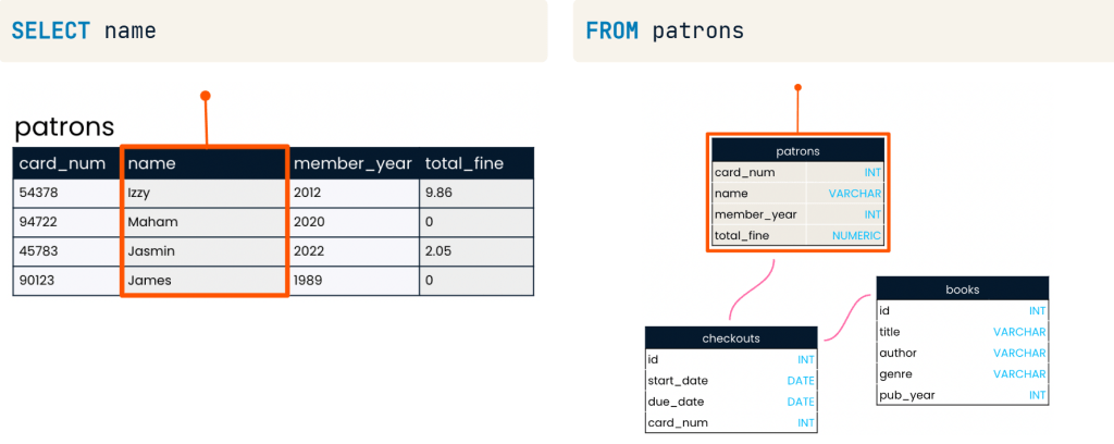
This project explores the use of Power BI to create dashboards that provide insights for improved business planning and decision-making within organizations. It also demonstrates how structured data can be presented in a clear and accessible manner through data storytelling.
Table of Content
- References, Resources & Files
- Navigate the power BI interface and import data
- Transform data using Power Query
- Insert and format a visualization
- Practice Data Visualization in Power BI
- Add more visuals to enhance storytelling
- Publish the report to the Power BI workspace
- Cumulative Activity Scenario
- Create Sales reports
- Create management reports
References, Resources & Files
This project contains the following three files:
Data Files
- This is an Excel file containing cookie shipping data that use to create reports have 2 sheets.
- Sheet 1, named “Orders” shows the following data.
- Order ID : The cookie shipping process based on each order.
- Customer ID : The order of 5 customer IDs connected to the “Customers” sheet.
- Rush Shipment : These shipments send express or regular.
- Cookies Shipped : These are cookies that have been shipped to customers.
- Revenue : Revenue from cookie sales
- Cost : Costs of cookie sales
- Order date : The date of shipment
- Sheet 2, named “Customers” shows details of customers who purchased products through 5 specific customers.
- Customer ID : Ordering of 5 customers with ID numbers linked to the “Order” sheet.
- Customer name : Show the information of the shipping company.
- Phone : The company phone number.
- Address : The company address
- City : City name
- State : State name
- Zip : Zip Number
- Country : Country of shipment
The data files contain raw, uncleaned data.
Practice Files
- A dataset of chocolate product information for a company that use to create reports have 2 sheets.
- Sheet 1, named “Orders” contains the following data:
- Order ID :The chocolate chip product distribution process based on orders.
- Order_date : The chocolate chip product shipping dates by order.
- Retail_number : List of retailers connected to the “Retailers” sheet.
- Quantity : The quantity of the product.
- Unit Price : Price per unit.
- Total Amount : Quantity * Unit Price
- Product : Chocolate Chip
- “Sheet 2, named ‘Retailer_Names‘, shows the following data:”
- ID : list of retailers linked to the ‘Orders’ sheet“.
- Retailer_Name : The name of the retail company
- Country : The countries of shipment
The practice files contain raw, uncleaned data.
Final Files
- This data file is for Emma’s coffee shop capstone task that use to create reports have 5 sheets.
- Sheet 1, named “Orders” contains the following data:
- Order ID : Show the order list of Coffee shop
- Customer ID :Show the customer sequence connected to the ‘Customer ID’ sheet.
- Product ID : Show the product sequence linked to the ‘Customer ID’ sheet.
- Quantity : The quantity of coffee.
- Unit Price : The price of coffee per unit.
- Order date : The date of the coffee sale.
- Sheet 2, named “Feedback” displays the following data:
- Feedback ID : Order of displaying customer feedback and suggestions.
- Customer ID : Show the customer order based on the “Orders” sheet.
- Rating : Coffee Rating
- Feedback : Text displaying customer feedback.
- Feedback date : Date of coffee shop reviews.
- Sheet 3, named “Inventory” displays the following data:
- Product ID : Show the product sequence from the “Orders” sheet.
- Stock Level : Stock levels of coffee
- Reorder Level : The stock level at which a new order should be placed.
- Supplier : Who buys products for another person.
- Sheet 4, named “Customers ID” displays the following data:
- Customer ID : Show the customer list connected to the “Orders” sheet.
- Customer Name : Customer’s name of Coffee Shop.
- Email : Email of customer’s Coffee Shop.
- Sheet 5, named “Product ID” displays the following data:
- Product ID : Show the product list connected to the “Orders” sheet.
- Product Name : Name of product in Coffee shop.
- Category : Category of product in Coffee shop.
- Price : Price of product in Coffee shop.
Navigate the power BI interface and import data
- Understand the basics of spreadsheets.
- Familiarity with data cleaning and IF/SUM functions in spreadsheets is required.
- The Microsoft account used to publish reports to Power BI.
Learning Objective
- Explore additional Power BI features like filtering publishing and graphs customization.
- Build report with visualizations
- Manage data relations and transform data with power Query
you could build a data model and start to build some visuals and add some filters to our data. Then, we’ll look on how to add a theme and share your report and dashboards with others.
Your Role : Data Analyst
You are a Data Analyst for Cookie Bliss, your mission is to create a Power BI report to help visualize key metrics more effienctly and then publish the dashboard to share it with your teammates, providing them with sales insights for better decision-making
Start Power BI
- Then, open Power BI.
- Then, Choose Blank Report

The side column of this table highlighted in red above the picture has four rows call “Visualizations Pane“.
| Visualizations Pane Type | Definition |
| Report View | The Dashboard Report |
| Table View | Dataset Details |
| Model View | Data Relationship Model |
| DAX Query View | DAX Query Editor |
- To create a dashboard, data must be selected.
Get Data –>Excel Workbook –>Select the file you want to use to create a dashboard.
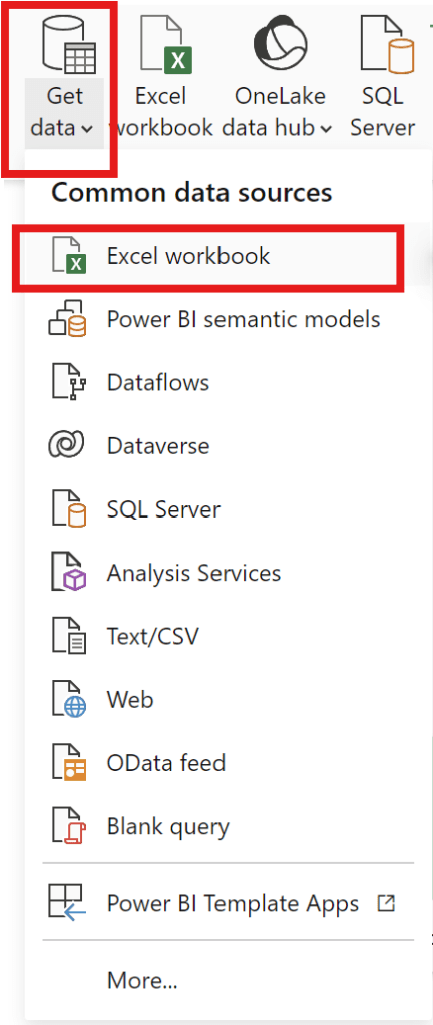
start from export file “data“
- and can add data can be exported from various common data sources.
- –> Choose file “data”
- –> Choose Customer2 table and Order1 table then click load.

Transform data using Power Query
how to transform data before starting to build our report.
- can check the Data and Visualization areas.
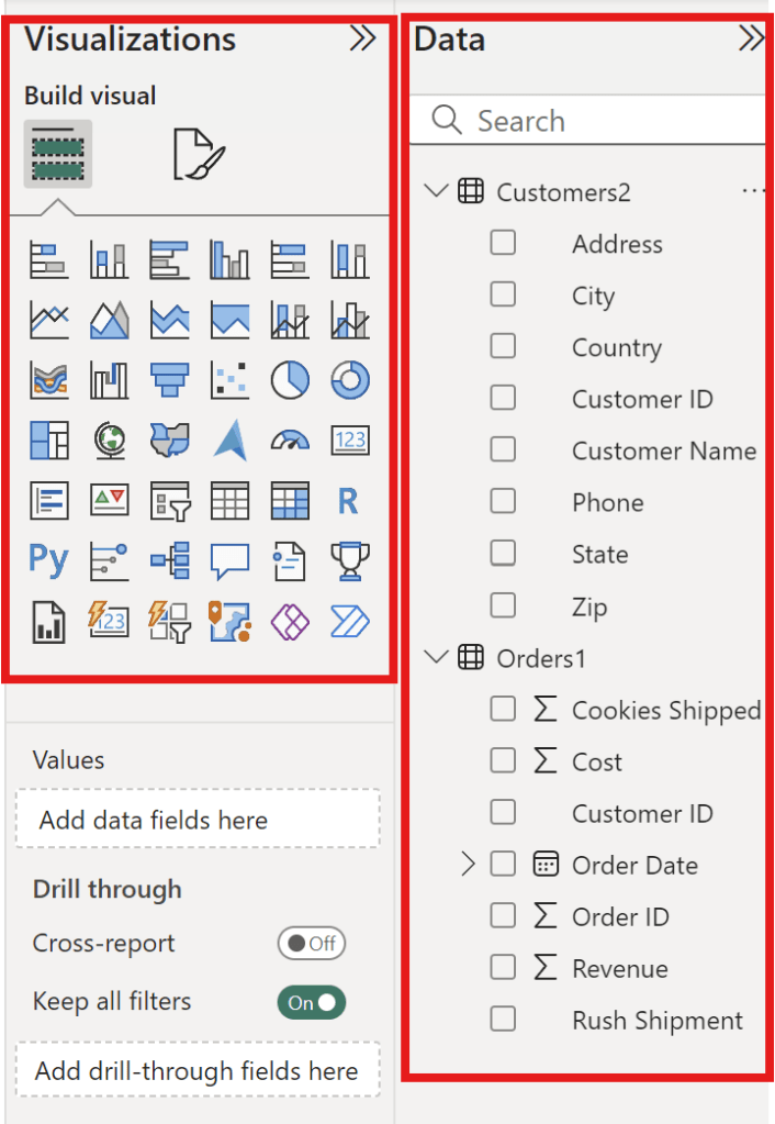
- Picture above show the Data and Visualization areas to see how each data element should be displayed.
Transform data process
Let’s start in the Table view.
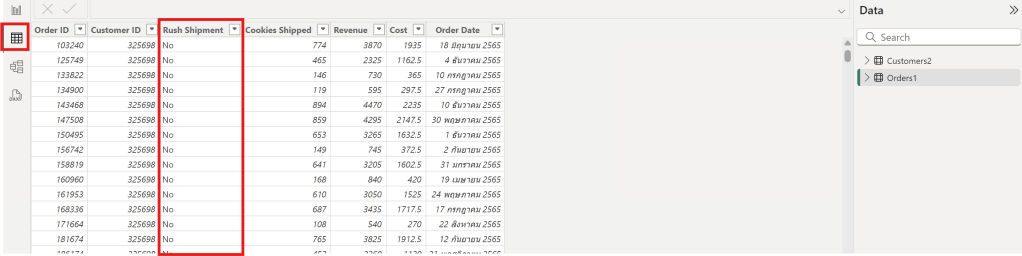
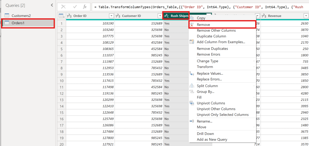
- In the Table view, the Rush Shipment column appears to be unnecessary from Order1 Table
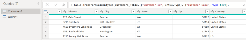
2. In the Table view, the Customer2 table has a column with both “United States” and “US” as values, which should be standardized to one name.
Remove column “Rush Shipment”
—> Choose orders 1 Table —> Choose Column Rush Shipment —> click Remove
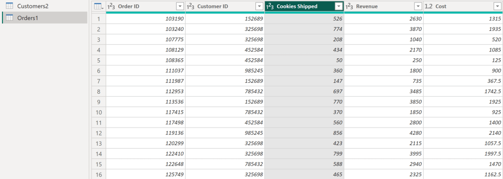
- After following the steps in the image, It will get the desired columns as follows:
- The Rush Shipment column has been removed.
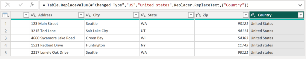
Then, clicking “Close & Apply” will result in a cleaned data table.
Replace Value
- Click Transform Data to Replace values.
- In the Customer 2 table, replace all “US” values in the Country column with “United States.” and then click OK
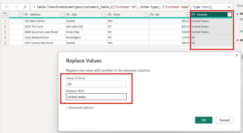
- As a result, Country column successfully replaced value as below.
Insert and format a visualization
- learn how to visualize data from multiple tables and customize graph formatting options.
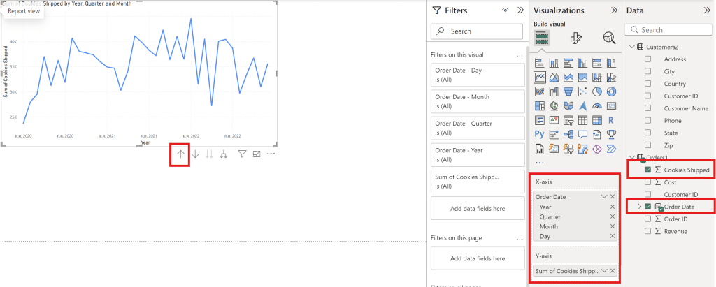
- create a line chart.
- Use the up arrow to change the data scale (day, month, and year)
| Axis | Column of Data File |
| Y-axis | Sum Cookies shipped |
| X-axis | Order Date |
Visual
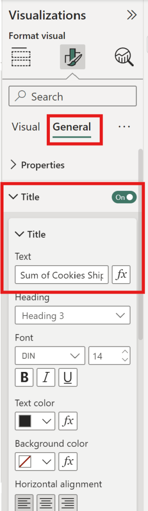
- can adjust the visual appearance of the data through the following Visual Format options.

- can edit Values.
- can choose Data label to show number in graph.
General
- can adjust the font size.
- can adjust the graph’s position.
- can adjust the graph’s color.
- can change the title.
Practice Data Visualization in Power BI
- You are a data analyst working with a chocolate factory and would like to help them visualize their data.
- The data is presented in the readings under “practice.xlsx” You need to import this data to Power BI, do the necessary transformation and data cleaning using Power Queries and then build the relationship betweendiffrerent columns. Finally, I need you to create a line chart that shows the evolution of sales over time.
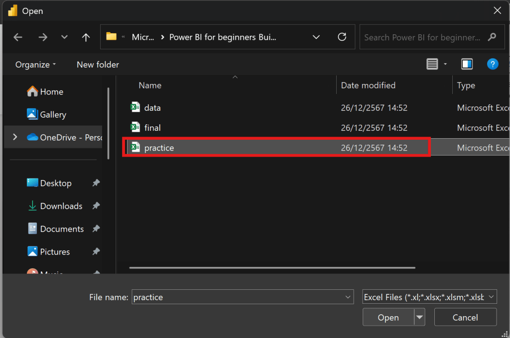
- start from export file “practice“
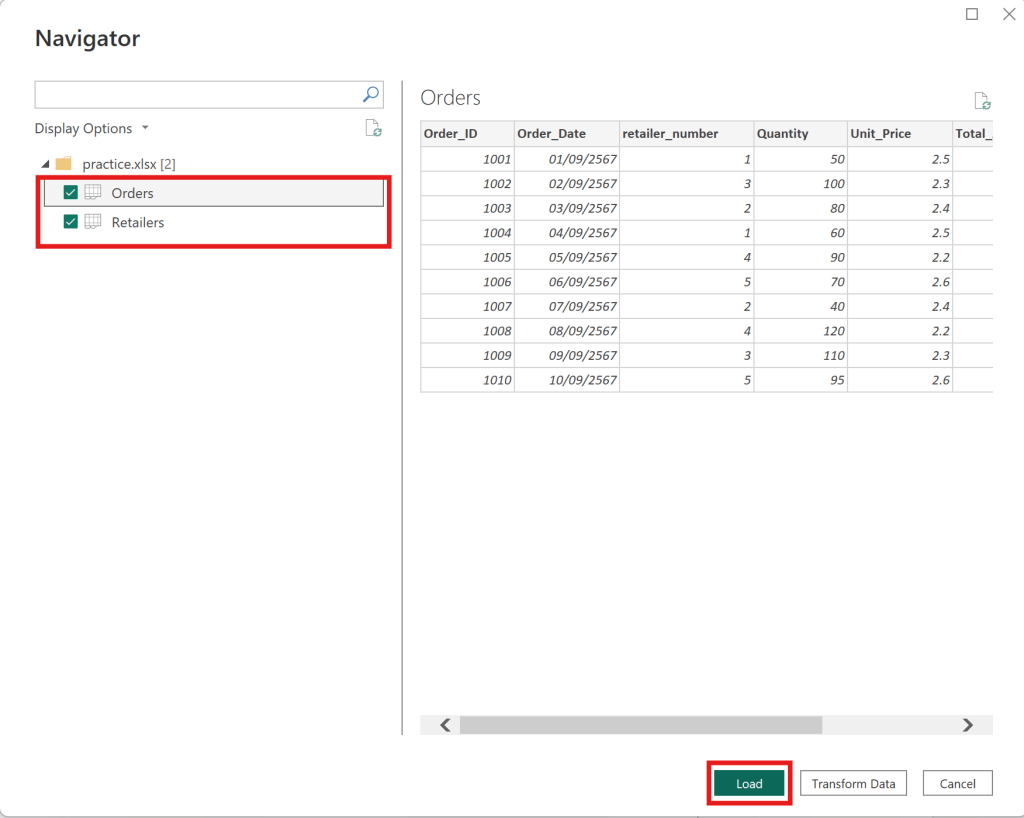
- upload Orders table and Retailer table —> click load as below
- Choose the Retailer Table to use Replace Value.
- Change “UK” to “United Kingdom“.

Then close and apply, and return to the dashboard.
Relationship
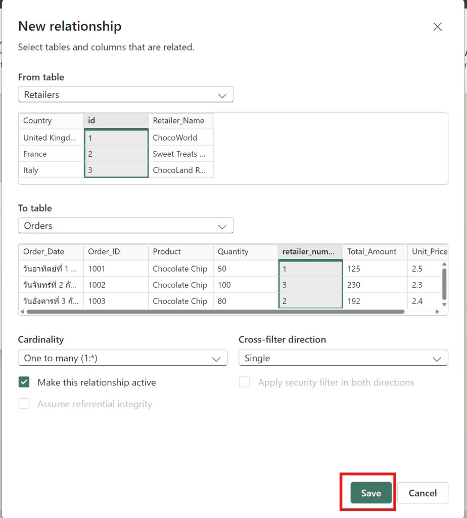
- To create a relationship between orders and retailers in Power BI
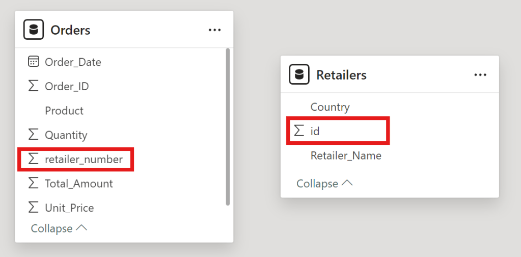
- drag id to retailer_number
- then click save to connect new relationship between Retailers id and Order retailer number
- Now that the data is cleaned and the relationship is created.
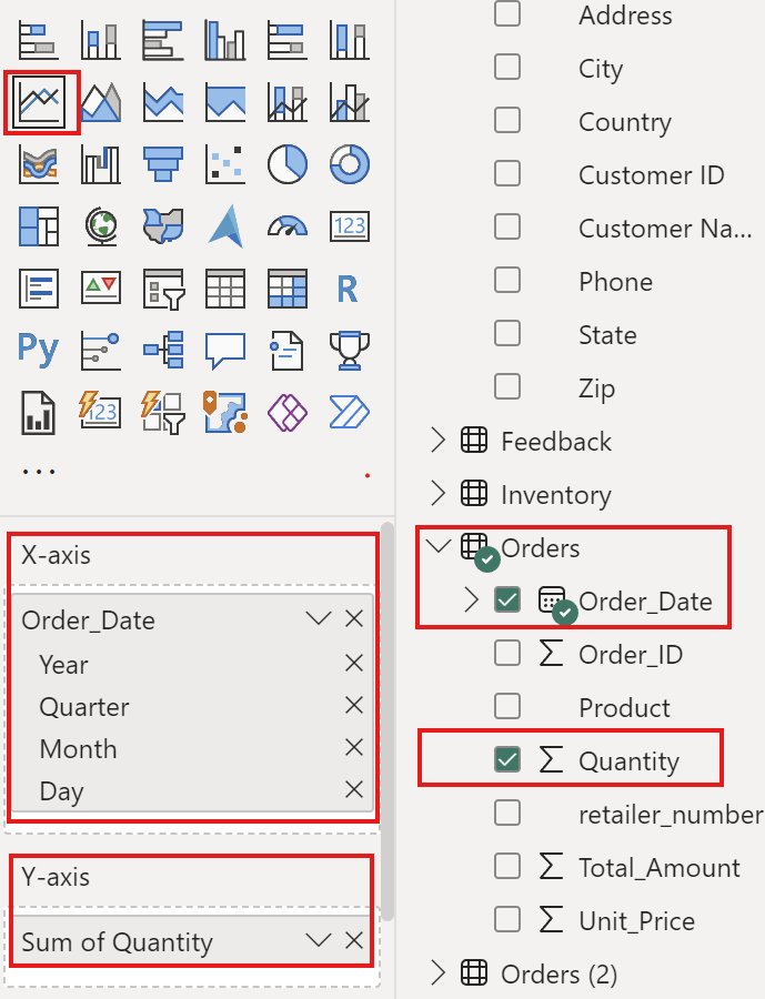
to create Line Chart between Order_date and Quantity

- then click line chart
| Axis | Column Data Files |
| X-Axis | Order date by day |
| Y-Axis | Quantity |
Now I can see the data by day of the quantity of chocolate bars sold. Now that you have a better handle of importing and preparing data into PowerBI and inserting your first visual.
Add more visuals to enhance storytelling
- show how to add additional graphs and pages to a report, as well as explore filtering options using maps, tables and bar graph.
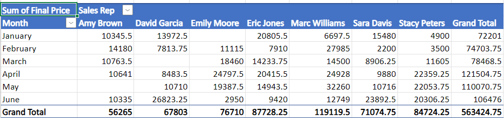
Card Chart
- to show the total revenue that we earned here at the Cookie Bliss.

- Choose card
- Choose fields as sum of revenue of Orders1 Table.

then it show revenue value
Table
- Show table of customer name

- Drag Customer name column then it show table of customer name.

Then it can show the interaction between Customer Name and Revenue value on the dashboard.
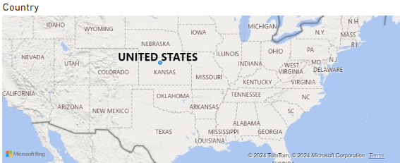
Map
- Choose map and then select country column
- then it show maps of country
Publish the report to the Power BI workspace
- then can change theme of dashboard by this theme.

- add the customer id and the phone number is good choice

- then add this title name as “Cookie Bliss Sales dashboard”

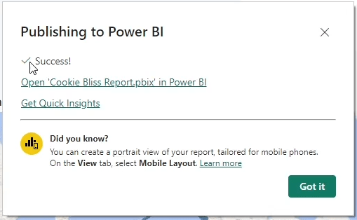
- publish to Power BI —> My workspace
- When it have success It finish publish Power BI
Cumulative Activity Scenario
- then get data final files to upload and do visualization
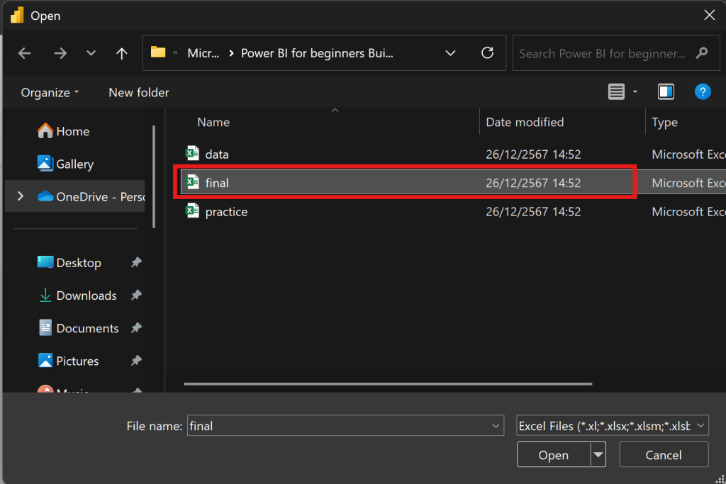
then choose all 5 tables Customers, Feedback, Inventory, Orders and Products
Products
- In Product table must clean data first
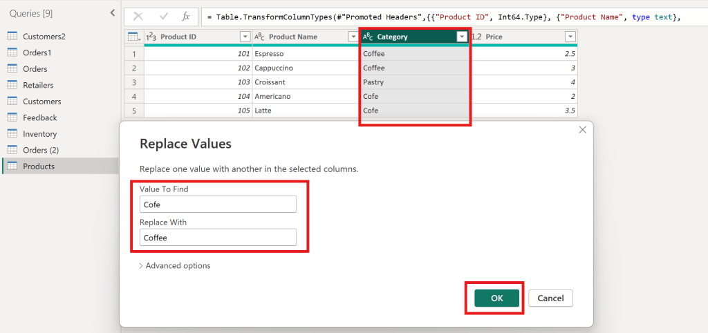
- Value to find “Cofe” replace with “Coffee”
- to make category have Coffee and Pastry
Inventory
- In Inventory table must clean data first

- Value to find “BeanWorld” replace with “Bean World”
- to make supplier have BeanWorld and PastryPro
Create Sales reports
- Create Title Sales Report
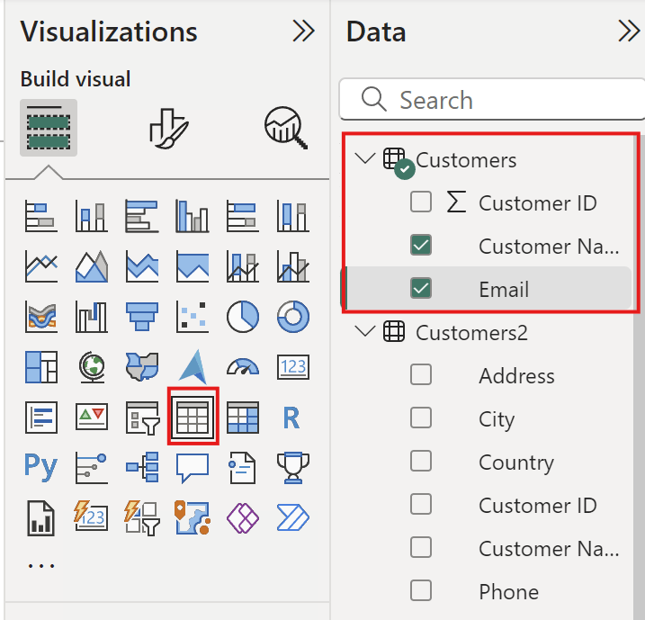
- Create Table
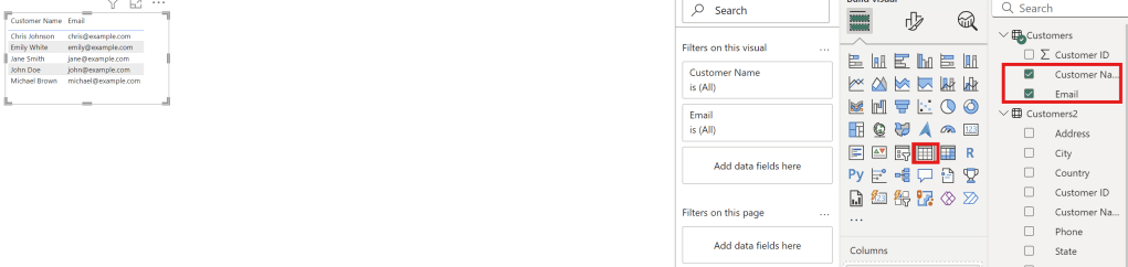
- Select Customer name and Email to create table
- Create line chart
| Axis | Column Final Files |
| X-Axis | Order Date |
| Y-Axis | Quantity |
- Create stacked bar chart
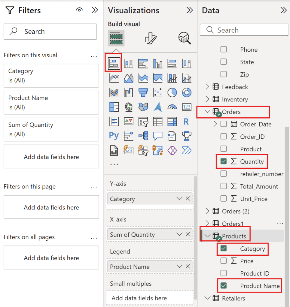
| Type | Column Final Files |
| Y-Axis | Category |
| X-Axis | Sum of Quantity |
| Legend | Product Name |
to see coffee that people love eat it.
Full Sale Report

Create management reports
- Create Title as management reports
- Create card of average rating

- Select Feedback table with Rating column and value with average of rating.
- Create table with customer name and emails
- Select Column as customer name and Email
- Create stack bar chart
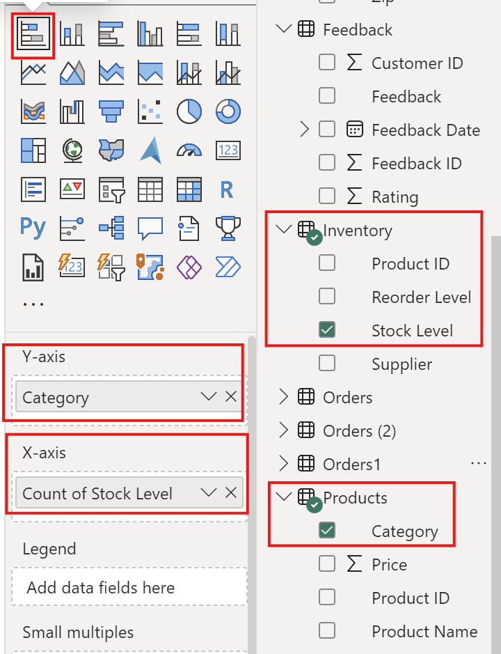
| Axis | Column Final Files |
| Y-Axis | Category |
| X-Axis | Stock Level |
- Create clustered column chart
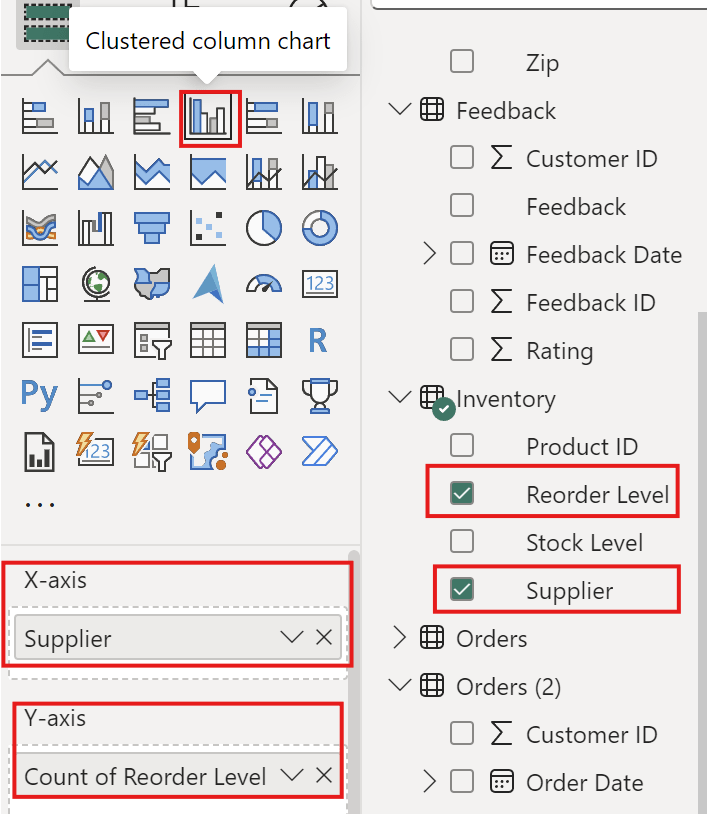
| Axis | Column Final Files |
| Y-Axis | Count of Reorder level |
| X-Axis | Supplier |
Full Management Reports

Summary
I hope this project helps users create dashboards in Power BI, improve their proficiency with the tool, and learn effective techniques for using titles, colors, and themes.
Coursera : https://www.coursera.org/account/accomplishments/verify/YWAXF815EXNK