Introduction
ในยุคที่ธุรกิจ e-Commerce ขับเคลื่อนด้วยข้อมูลอย่างเข้มข้น ในส่วนของพฤติกรรมการซื้อ-ขายบนแพลตฟอร์มต่างๆ ถือเป็นสินทรัพย์เชิงกลยุทธ์ที่มีมูลค่ามหาศาล ความเชี่ยวชาญของผมคือการเปลี่ยนข้อมูลดิบ (Raw Data) เหล่านั้นให้กลายเป็นกลยุทธ์ที่จับต้องได้ โดยการใช้ SQL และ BigQuery ในการจัดการและวิเคราะห์ข้อมูลขนาดใหญ่ (Big Data) พร้อมทั้งแปลงข้อมูลให้เห็นภาพ (Data Visualization) ผ่าน Google Sheets และ Looker Studio (Data Studio) เพื่อส่งมอบ Key Insights และ Business Recommendations ที่แม่นยำ ช่วยขับเคลื่อนการตัดสินใจและสร้างการเติบโตทางธุรกิจได้อย่างแท้จริง
Dataset Reference
https://www.kaggle.com/datasets/olistbr/brazilian-ecommerce
Big Query -> Google Sheet
ได้ข้อมูลจาก Data จาก Big Query มาเป็น Google sheet ได้จาก link นี้: https://docs.google.com/spreadsheets/d/11gIwtl0Mz9Lx3D-rnuGE5urOnSwgFU8CYqimfI7bzmc/edit?gid=1424175902#gid=1424175902
Google Sheet -> Data Studio
Data Studio จาก google sheet ที่เป็น Data Source ดังนี้
https://datastudio.google.com/reporting/6c425f7f-1107-4fe7-865d-95995947d090
Table of Content from Olist
- Introduction
- Project Overview & Objective
- Tech Stack & Data Pipeline
- Data Source
- Big Query Process
- First Method : Create Dataset
- Second Method : Create Table
- RFM Analysis
- Export form Big Query to Data Studio
- Data studio
- Key Insights from Dashboard
- Business Recommendations
- Conclusion
Project Overview & Objective
Challenge
- โจทย์ของ Project นี้มีไว้เพื่อวิเคราะห์ภาพรวมและจัดกลุ่มประสิทธิภาพของหมวดหมู่สินค้าของธุรกิจ e-Commerce จาก Big-Query ในประเทศบราซิล (Olist Dataset) ว่าในข้อมูลเหล่านี้มีข้อมูลเชิงลึกอะไรที่น่าสนใจบ้าง
Goal
- เป้าหมายสำหรับ Project นี้มีการประยุกต์ใช้แนวความคิดของ RFM Analysis เพื่อเปลี่ยนมิติจากการมองพฤติกรรมของลูกค้า มาเป็นการประเมินว่ามี Quality หรือ Product Segment ที่ดีมั้ยในการขาย เพื่อช่วยให้ทีมบริหารจัดสรรทรัพยากร วางแผนการตลาด และจัดการสินค้าคงคลังได้อย่างแม่นยำ
Tech Stack & Data Pipeline
Google Cloud BigQuery (SQL)
ใช้ในการเขียนคำสั่งวิเคราะห์ระดับสูง ใช้ CTE (WITH) ในการจัดระเบียบโครงสร้างโค้ด และใช้ Window Functions (NTILE()) ในการทำ Scoring แบ่งเกรดสินค้าออกเป็น 5 ระดับอย่างเที่ยงตรง รวมถึงมีการล้างข้อมูล (Data Cleaning) กรองออเดอร์ที่พังออกด้วย
WHERE order_status NOT IN ('canceled', 'unavailable')
Looker Studio
ใช้ในการออกแบบและทำ Data Visualization เปลี่ยนผลลัพธ์จาก SQL (Big Query) เป็นลงในการ Google Sheet แล้วมาสร้างระบบ Dashboard ใน Data Studio ที่เป็น Interactive (สามารถกดฟิลเตอร์เลือกดูตามกลุ่มสินค้าได้ทันที)
SQL (Big Query) -> Google Sheet -> Data Studio
Data Source
- เป็นข้อมูลของแบรนด์ Olist ซึ่งเป็น Platform E-Commerce ยักษ์ใหญ่ที่ช่วยเชื่อมต่อร้านค้าขนาดเล็กของบราซิลเข้ากับช่องทางการขายออนไลน์ต่างๆ โดยเป็นข้อมูลช่วงปี 2016 ถึง 2018 รวมแล้วประมาณ 100,000 คำสั่งซื้อ
Element of table
มีข้อมูลทั้งหมด 9 ตารางดังนี้
olist_orders_dataset
เป็นตารางหลัก ซึ่งเป็น primary key สำหรับข้อมูลชุดนี้
เป็นตารางที่ไว้บอกการเก็บสถานะของคำสั่งซื้อ (เช่น delivered, shipped, canceled) และที่สำคัญที่สุดคือมี Timestamp ของทุก Process เช่น วันที่กดสั่งซื้อ, วันที่กดยืนยันชำระเงิน, วันที่ส่งของให้ขนส่ง, และวันที่ของถึงมือลูกค้า (เหมาะมากกับการทำ Time-to-Delivery Analysis)
olist_order_items_dataset
- รายละเอียดสินค้าในแต่ละบิล เช่น
- บิลนี้ซื้อสินค้าอะไรบ้าง (Product ID)
- ซื้อจากร้านไหน (Seller ID)
- ราคาเท่าไหร่ (Price)
- ค่าส่งเท่าไหร่ (Freight Value)
olist_products_dataset
- ข้อมูลของตัวสินค้า เช่น หมวดหมู่สินค้า (Category Name), ขนาด, น้ำหนัก และจำนวนรูปภาพที่ใช้โปรโมท (เอาไว้ทำวิเคราะห์ได้ว่า สินค้าที่รูปเยอะๆ หรือน้ำหนักเยอะ มีผลต่อยอดขายและค่าส่งอย่างไร)
olist_order_payments_dataset
- รูปแบบการชำระเงิน (เช่น บัตรเครดิต, บิลเงินสด, บัตรกำนัล) และจำนวนงวดที่ขอผ่อนชำระ (Installments)
olist_order_reviews_dataset
- คะแนนรีวิว (Review Score 1-5 ดาว) พร้อมข้อความรีวิวจากลูกค้า (ตารางนี้สายหัตถการหรือบริการแบบคุณสามารถนำมาฝึกทำ Sentiment Analysis หรือดูว่าลูกค้าติชมเรื่องอะไรได้ดีมาก)
olist_customers_dataset
- ข้อมูลฝั่งลูกค้า โดยจะมี ID ของลูกค้า และรหัสไปรษณีย์ (Zip Code) เมือง และรัฐที่ลูกค้าอาศัยอยู่
olist_sellers_dataset
- ข้อมูลฝั่งร้านค้าที่มาลงขาย มีรหัสไปรษณีย์ เมือง และรัฐ ของร้านค้าเช่นกัน
olist_geolocation_dataset
- พิกัดละติจูด (Latitude) และลองจิจูด (Longitude) ของรหัสไปรษณีย์ต่างๆ ในบราซิล (อันนี้ไฮไลท์เลยครับ! เพราะคุณสามารถดึงไปพลอตแผนที่ Heatmap สวยๆ บน Looker Studio โชว์สกิลการทำ Geospatial Analysis ได้เลย)
product_category_name_translation
- ตารางพจนานุกรม เนื่องจากข้อมูลหมวดหมู่สินค้าในตารางหลักเป็นภาษาโปรตุเกส ตารางนี้จะช่วยแปลเป็นภาษาอังกฤษให้เราอ่านง่ายขึ้นครับ
Big Query Process
Create Dataset
การสร้าง Dataset คือหน่วยที่ใช้ในการจัดกลุ่มตารางข้อมูล (Tables) หรือมุมมองข้อมูล (Views) ที่มีความเกี่ยวข้องกันให้อยู่ในที่เดียวกัน เปรียบเสมือนการสร้าง “โฟลเดอร์หลัก” เพื่อรองรับไฟล์งานทั้งหมดของโปรเจกต์นี้
Create Table
การสร้าง Table คือการนำไฟล์ข้อมูลดิบ (เช่น
.csv) ที่เตรียมไว้ ขึ้นไปสร้างเป็นตารางข้อมูลในระบบ โดยโครงสร้างการตั้งค่าของ BigQuery
First Method : Create Dataset
- เริ่มจากการตั้งชื่อ DataSet ใน BigQuery ก่อนด้วยชื่อ Brazilian_ECommerce
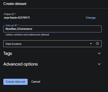
หลังจากนั้นพิมพ์ชื่อลงไปแล้วกด Create Data Set ก็จะสามารถได้ Dataset ใหม่ใน Big Query
Second Method : Create Table
วิธีสร้าง Table ใน big query มีอยู่ 4 part ด้วยกัน
- Source
- Destination
- Schema
- Advanced Option
Source
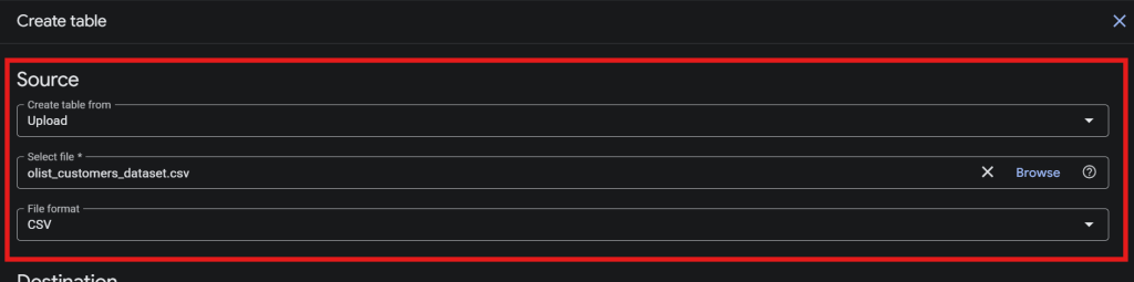
- ช่วงของ Source เลือกกด Upload จริงๆ สามารถเลือกได้หลากหลาย Data Source
- หลังจากนั้น Select file “olist_customers_dataset”
- หลัง File Format จะปรับเป็น CSV เอง
Destination
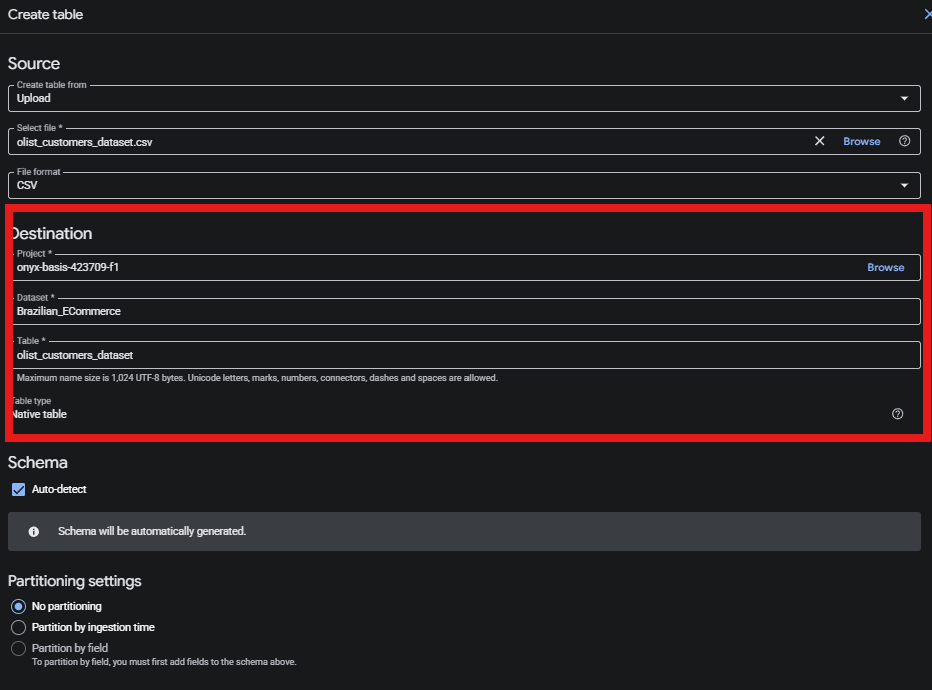
- Project ให้ชื่อที่เราสร้างขึ้น onyx-basis-423709-f1
- Dataset ให้เลือกสิ่งที่เราได้สร้างไว้ด้านบน Brazilian_ECommerce
- Table สามารถใช้ชื่อที่เราอยากตั้งได้เลย olist_customers_dataset
Schema

- สำหรับ Schema ให้เลือก Auto-detect
Advanced options
- เลือก Header rows to skip คือ 1 ให้เลือกข้าม Column 1
- ให้เลือก Quoted newlines
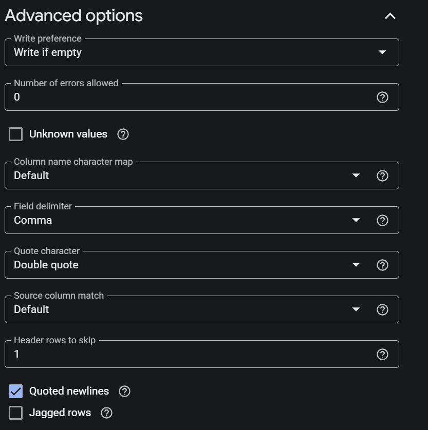
- แล้วก็สร้างแบบนี้ทั้ง 9 ตาราง จากข้อมูลตารางด้านบน
RFM Analysis
- RFM Analysis (Recency, Frequency, Monetary) เป็นเครื่องมือทางการตลาดที่นิยมใช้ในการวิเคราะห์พฤติกรรมและความจงรักภักดีของ Product Health Analytics) แยกตามหมวดหมู่สินค้าทั้ง 74 หมวดหมู่ แทนการมองรายบุคคล เพื่อค้นหาว่าสินค้ากลุ่มไหนคือ Top Tier ของ product_category_name
-- 1.Find Max Date with WITH Function
WITH reference_date AS (
  SELECT MAX(order_purchase_timestamp) AS max_date
  FROM `onyx-basis-423709-f1.Brazilian_ECommerce.olist_orders_dataset`
),

-- 2.Find RFM Analysis
product_rfm_raw AS (
  SELECT
    COALESCE(p.product_category_name, 'unknown') AS product_category_name,

    -- Recency (R):
    DATE_DIFF(DATE((SELECT max_date FROM reference_date)), DATE(MAX(o.order_purchase_timestamp)), DAY) AS recency,

    -- Frequency (F):
    COUNT(DISTINCT o.order_id) AS frequency,

    -- Monetary (M):
    SUM(oi.price) AS monetary

  FROM `onyx-basis-423709-f1.Brazilian_ECommerce.olist_orders_dataset` o
  -- JOIN Table Items
  JOIN `onyx-basis-423709-f1.Brazilian_ECommerce.olist_order_items_dataset` oi
    ON o.order_id = oi.order_id
  -- JOIN Table Products
  JOIN `onyx-basis-423709-f1.Brazilian_ECommerce.olist_products_dataset` p
    ON oi.product_id = p.product_id

  WHERE o.order_status NOT IN ('canceled', 'unavailable')
  GROUP BY p.product_category_name
),

-- 3. Change 1-5 (Scoring) divide segment
product_scoring AS (
  SELECT
    product_category_name,
    recency,
    frequency,
    monetary,
    -- R_Score: หมวดที่เพิ่งขายได้เร็วๆ นี้ (ค่าน้อย) ได้คะแนนสูง
    NTILE(5) OVER (ORDER BY recency DESC) AS r_score,
    -- F_Score: หมวดที่ขายได้จำนวนครั้งเยอะ ได้คะแนนสูง
    NTILE(5) OVER (ORDER BY frequency ASC) AS f_score,
    -- M_Score: หมวดที่ทำเงินรวมให้บริษัทสูงที่สุด ได้คะแนนสูง
    NTILE(5) OVER (ORDER BY monetary ASC) AS m_score
  FROM product_rfm_raw
)

-- 4. Divide (Product Segmentation) from score
SELECT
  product_category_name,
  recency,
  frequency,
  monetary,
  r_score,
  f_score,
  m_score,
  CONCAT(CAST(r_score AS STRING), CAST(f_score AS STRING), CAST(m_score AS STRING)) AS product_rfm_code,

-- Condition of segment
  CASE
    WHEN r_score >= 4 AND f_score >= 4 AND m_score >= 4 THEN 'Star Products'
    WHEN r_score >= 3 AND f_score >= 3 AND m_score >= 3 THEN 'Steady Sellers'
    WHEN r_score >= 4 AND f_score <= 2 AND m_score >= 3 THEN 'Trending / New Stars'
    WHEN r_score <= 2 AND f_score >= 3 AND m_score >= 3 THEN 'Fading Giants'
    WHEN r_score <= 2 AND f_score <= 2 AND m_score <= 2 THEN 'Dead Stock / Slow Moving'
    ELSE 'General Products'
  END AS product_segment
FROM product_scoring
ORDER BY monetary DESC;
Table 1 : With Reference_date AS
-- 1.Find Max Date with WITH Function
WITH reference_date AS (
  SELECT MAX(order_purchase_timestamp) AS max_date
  FROM `onyx-basis-423709-f1.Brazilian_ECommerce.olist_orders_dataset`
),
- คือประกาศสร้างตารางขึ้นมาชั่วคราว เลือกค่าวันที่มาเยอะที่สุด
- ตั้งชื่อ max_date เพื่อดูว่า order สุดที่เกิดขึ้นมาคือ order เกิดขึ้นวันไหน
- ให้ไปดึงข้อมูลมาจากตารางประวัติการสั่งซื้อ FROM onyx-basis-423709-f1.Brazilian_ECommerce.olist_orders_dataset
Solve Problem
- การแก้ปัญหาข้อจำกัดของ Aggregate Function ใน SQL
ขั้นตอนสำหรับการหา (
product_rfm_raw) จำเป็นต้องหาค่าวันซื้อล่าสุดของสินค้าแต่ละหมวดหมู่ด้วยคำสั่งMAX(o.order_purchase_timestamp)ในทางไวยากรณ์ของภาษา SQL จึงไม่สามารถเอา Aggregate Function สองตัวมาคำนวณซ้อนกันตรงๆ ในบรรทัดเดียวได้ (เช่น เขียน
DATE_DIFF(MAX(...), MAX(...))ลบกันตรงๆ ระบบจะแสดง Error ออกมาทันที)การแยกคำสั่ง
MAX()ตัวแรกสุดของทั้งระบบไปไว้ในWITH reference_dateจึงเป็นการแปลงค่าวันสุดท้ายของร้านให้กลายเป็น “ค่าคงที่ (Constant Value)” ล่วงหน้า ทำให้เราสามารถดึงคำสั่ง(SELECT max_date FROM reference_date)มาลบกับค่าMAXรายสินค้าในขั้นตอนถัดไปได้อย่างราบรื่นครับ
Table 2 : product-frm-raw AS
product_rfm_raw AS (
  SELECT
    COALESCE(p.product_category_name, 'unknown') AS product_category_name,

    -- Recency (R):
    DATE_DIFF(DATE((SELECT max_date FROM reference_date)), DATE(MAX(o.order_purchase_timestamp)), DAY) AS recency,

    -- Frequency (F):
    COUNT(DISTINCT o.order_id) AS frequency,

    -- Monetary (M):
    SUM(oi.price) AS monetary

  FROM `onyx-basis-423709-f1.Brazilian_ECommerce.olist_orders_dataset` o
  -- JOIN Table Items
  JOIN `onyx-basis-423709-f1.Brazilian_ECommerce.olist_order_items_dataset` oi
    ON o.order_id = oi.order_id
  -- JOIN Table Products
  JOIN `onyx-basis-423709-f1.Brazilian_ECommerce.olist_products_dataset` p
    ON oi.product_id = p.product_id

  WHERE o.order_status NOT IN ('canceled', 'unavailable')
  GROUP BY p.product_category_name
),
- เป็นตารางสร้างที่เพื่อคำนวณค่าตัวเลข Recency, Frequency, Monetary ของ model RFM Analysis
SELECT product_category_name
COALESCE(p.product_category_name, 'unknown') AS product_category_name,
บรรทัด SQL ด้านบนดึงชื่อ product_category_name ถ้าสินค้าชิ้นไหนไม่มีชื่อหมวดหมู่ จะแสดงค่า NULLให้เปลี่ยนคำแสดงเป็น ‘unknown‘ แทนเพื่อไม่ให้ข้อมูลหลุดหาย
Find Recency Date
- เป็นการเลือกหมวดนี้ขายได้ครั้งล่าสุดกี่วันมาแล้ว
DATE_DIFF(DATE((SELECT max_date FROM reference_date)), DATE(MAX(o.order_purchase_timestamp)), DAY) AS recency,
- นำ วันที่อ้างอิงล่าสุด (SELECT max_date FROM reference_date) ที่เราตั้งไว้ใน Table ที่ 1 ซึ่งคือ คำสั่งซื้อครั้งล่าสุด – MAX(order_purchase_timestamp) วันที่สุดท้ายที่ซื้อจากที่จากตาราง olist_orders_dataset เพื่อหาว่าวันซื้อล่าสุดห่างจากวันที่ซื้อครั้งแรกเท่าไร
- ใช้ DATE_DIFF เพื่อให้ผลลัพธ์ออกมาเป็น
จำนวนวัน - สามารถนำวันเหล่าไปหาอ้างอิงได้ว่าลูกค้าที่ขาดกับเรานานมีอะไรบ้างแล้วไปตามลูกค้าเหล่านั้น
Find Frequency
COUNT(DISTINCT o.order_id) AS frequency,
- นับเพื่อตัด order_id ที่ซ้ำให้เหลือ ให้เหลือเฉพาะค่าที่ไม่ซ้ำกัน (Unique Values ของ order_id) เพียงค่าเดียว จาก table olist_orders_dataset
Find Monetary
SUM(oi.price) AS monetary
- ราคารวมสินค้าต่อชิ้นในออร์เดอร์นั้นๆ จาก table olist_order_items_dataset
Join 3 Table
FROM `onyx-basis-423709-f1.Brazilian_ECommerce.olist_orders_dataset` o
  JOIN `onyx-basis-423709-f1.Brazilian_ECommerce.olist_order_items_dataset` oi
    ON o.order_id = oi.order_id
  JOIN `onyx-basis-423709-f1.Brazilian_ECommerce.olist_products_dataset` p
    ON oi.product_id = p.product_id
- เป็นการ join ทั้ง 3 ตารางเข้าด้วยกัน
- JOIN ตาราง orders เข้ากับ ตาราง Items เพื่อดูว่าออเดอร์นั้นซื้อสินค้าชิ้นไหน ราคาเท่าไหร่
- JOIN ตาราง Items เข้ากับ ตาราง Products เพื่อดึงชื่อหมวดหมู่สินค้า
Use Where and Group by
WHERE o.order_status NOT IN ('canceled', 'unavailable')
  GROUP BY p.product_category_name
- ให้เลือก order_status ที่ไม่ได้มี Status canceled กับ unavailable ออกมา โดยจัดกลุ่มตาม product_category_name
Table 3 : product_scoring AS
-- 3. Change 1-5 (Scoring) divide segment
product_scoring AS (
  SELECT
    product_category_name,
    recency,
    frequency,
    monetary,
    -- R_Score: categories with recent sales received high scores.
    NTILE(5) OVER (ORDER BY recency DESC) AS r_score,
    -- F_Score: categories with frequency sales receive high scores.
    NTILE(5) OVER (ORDER BY frequency ASC) AS f_score,
    -- M_Score: categories with high sales receive high scores.
    NTILE(5) OVER (ORDER BY monetary ASC) AS m_score
  FROM product_rfm_raw
)
NTILE
NTILE(5) ใน SQL คือ Window Function ที่ใช้สำหรับ แบ่งข้อมูลออกเป็น 5 กลุ่มเท่าๆ กัน โดยจะเรียงลำดับข้อมูลจากมากไปน้อย (หรือน้อยไปมาก) ตามที่เรากำหนดก่อน แล้วค่อยแจกเลขกลุ่ม (1, 2, 3, 4, 5) ให้กับข้อมูลแต่ละแถว
Product_scoring
- คือการสร้างตารางขึ้นมาเพื่อตัดเกรดสินค้าออกเป็น 5 ระดับตาม 3 หัวข้อ ดังนี้
| Type of Scoring | Definition |
| Recency | ยิ่งเพิ่งขายได้เร็วๆนี้ Recency น้อย ยิ่งได้กลุ่มคะแนนสูง เกรด 5 การซื้อสินค้าล่าสุดเวลายิ่งน้อยยิ่งดี |
| Frequency | ยิ่งขายได้จำนวนครั้งเยอะ Frequency มาก ยิ่งได้กลุ่มคะแนนสูง เกรด 5 |
| Monetary | ยิ่งยอดซื้อเยอะ Monetary มาก ยิ่งได้กลุ่มคะแนนสูง เกรด 5 |
แล้วเลือก product_category_name, recency, frequency, monetary, r_score, f_score, m_score FROM product_rfm_raw จากตารางที่ 2 ที่เราตั้งขึ้น
Table 4 : Product Segmentation
-- 4. Divide (Product Segmentation) from score
SELECT
  product_category_name,
  recency,
  frequency,
  monetary,
  r_score,
  f_score,
  m_score,
  CONCAT(CAST(r_score AS STRING), CAST(f_score AS STRING), CAST(m_score AS STRING)) AS product_rfm_code,

-- Condition of segment
  CASE
    WHEN r_score >= 4 AND f_score >= 4 AND m_score >= 4 THEN 'Star Products'
    WHEN r_score >= 3 AND f_score >= 3 AND m_score >= 3 THEN 'Steady Sellers'
    WHEN r_score >= 4 AND f_score <= 2 AND m_score >= 3 THEN 'Trending / New Stars'
    WHEN r_score <= 2 AND f_score >= 3 AND m_score >= 3 THEN 'Fading Giants'
    WHEN r_score <= 2 AND f_score <= 2 AND m_score <= 2 THEN 'Dead Stock / Slow Moving'
    ELSE 'General Products'
  END AS product_segment
FROM product_scoring
ORDER BY monetary DESC;
product_rfm_code
- เป็นการสร้าง product_rfm_code เพื่อเอาคะแนนตัวเลข 3 ตัวมา “ต่อกันเป็นข้อความตัวเดียว” (เช่น คะแนน R=5, F=4, M=5 จะกลายเป็นรหัส “545”) เพื่อให้เราเห็นโปรไฟล์ของสินค้าหมวดนั้นๆ ได้ทันทีด้วยรหัส 3 หลัก
CONCAT(CAST(r_score AS STRING), CAST(f_score AS STRING), CAST(m_score AS STRING)) AS product_rfm_code
- เขียน CAST(… AS STRING) เพื่อสั่งให้ระบบเปลี่ยนสถานะของตัวเลขเหล่านั้น ให้กลายเป็น “ตัวอักษร/ข้อความ” ก่อน เพื่อให้ระบบมองเลข 5 เป็นแค่ตัวอักษรตัวหนึ่ง ไม่ใช่จำนวนนับ
Condition of product_category_name
-- Condition of segment
  CASE
    WHEN r_score >= 4 AND f_score >= 4 AND m_score >= 4 THEN 'Star Products'
    WHEN r_score >= 3 AND f_score >= 3 AND m_score >= 3 THEN 'Steady Sellers'
    WHEN r_score >= 4 AND f_score <= 2 AND m_score >= 3 THEN 'Trending / New Stars'
    WHEN r_score <= 2 AND f_score >= 3 AND m_score >= 3 THEN 'Fading Giants'
    WHEN r_score <= 2 AND f_score <= 2 AND m_score <= 2 THEN 'Dead Stock / Slow Moving'
    ELSE 'General Products'
  END AS product_segment
FROM product_scoring
ORDER BY monetary DESC;
| Condition of product_category_name | Definition |
| Star Products | r_score >= 4 AND f_score >= 4 AND m_score >= 4 |
| Steady Sellers | r_score >= 3 AND f_score >= 3 AND m_score >= 3 |
| Trending / New Stars | r_score >= 4 AND f_score <= 2 AND m_score >= 3 |
| Fading Giants | r_score <= 2 AND f_score >= 3 AND m_score >= 3 |
| Dead Stock / Slow Moving | r_score <= 2 AND f_score <= 2 AND m_score <= 2 |
| General Products | คะแนนที่อยู่นอกเหนือเกณฑ์ด้านบน |
- แล้วตั้งชื่อเงื่อนไขเหล่านี้ทั้งหมดว่า product_segment
- จากตาราง product_scoring แล้วเรียงข้อมูลจากมากไปน้อย จาก Column monetary ที่เป็นยอดขาย
Export form Big Query to Data Studio
แล้ว Export จาก Big query มา Google sheet แล้วเชื่อม data source ที่ data studio อีกทีเพราะ 3 เรื่องดังนี้
- เรื่องค่าใช้จ่าย (Cost Optimization) ****
- ความยืดหยุ่นในการแต่งข้อมูล (Data Manipulation)
- สิทธิ์ในการเข้าถึงข้อมูล (Access Control)
ได้ข้อมูลจาก Data จาก Big Query มาเป็น Google sheet ได้จาก link นี้: https://docs.google.com/spreadsheets/d/11gIwtl0Mz9Lx3D-rnuGE5urOnSwgFU8CYqimfI7bzmc/edit?gid=1424175902#gid=1424175902
Cost Optimization
การประหยัดค่าใช้จ่ายในการ Query
- เพื่อลดค่าใช้จ่ายในการ Scan ข้อมูลบน BigQuery โดยใช้ Google Sheets เป็นตัวพักข้อมูล (Data Caching) ทำให้ Looker Studio ไม่ต้องยิง Query ตรงไปที่คลังข้อมูลทุกครั้งที่มีการเปลี่ยนตัวกรอง
Data Manipulation
ความสะดวกและความยืดหยุ่นสำหรับ Data Analyst ในการปรับข้อมูล
- ช่วยให้ Data Analyst สามารถปรับแต่งข้อมูล เพิ่มเติมคอลัมน์คำนวณ หรือทำ Data Cleaning เล็กๆ น้อยๆ ได้อย่างยืดหยุ่นและรวดเร็วกว่าการแก้โครงสร้าง Pipeline บน Cloud
Access Control
สิทธิ์ในการเข้าถึงข้อมูล
- เป็นการจำกัดสิทธิ์การเข้าถึงฐานข้อมูลหลัก (BigQuery) เพื่อความปลอดภัย และแชร์เฉพาะข้อมูลสรุปที่จำเป็นผ่าน Google Sheets ให้กับผู้เกี่ยวข้องนำไปใช้งานต่อได้อย่างปลอดภัย
Data studio
Data Studio จาก google sheet ที่เป็น Data Source ดังนี้
https://datastudio.google.com/reporting/6c425f7f-1107-4fe7-865d-95995947d090
Drop Down

- มีการสร้าง Drop down จาก 2 Column เพื่อหา Insight ได้
Product_english_name
สร้างด้วย Column Product_english_name
- กรองข้อมูลรายชื่อสินค้าในระดับสากล เพื่อดูประสิทธิภาพและยอดขายของสินค้าแต่ละรายการโดยตรง
Product_Segment
สร้างด้วย Column Product_Segment
- กรองข้อมูลตามหมวดหมู่หรือกลุ่มสินค้า เพื่อวิเคราะห์ภาพรวมและแนวโน้มการเติบโตของแต่ละ Segment
Scorecard
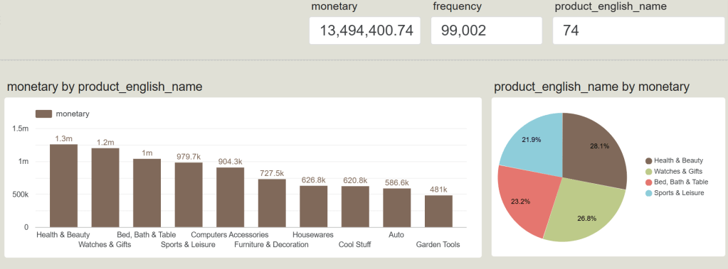
เป็นส่วนที่บอกเรื่องภาพรวมทั้งหมดของ Product_english_name เพื่อให้เห็นขนาดของธุรกิจ (Scale):
- monetary (13,494,400.74): ยอดขายสะสมรวมทั้งหมดของร้านค้า คิดเป็นเงินประมาณ 13.5 ล้าน
- frequency (99,002): จำนวนครั้งที่มีการสั่งซื้อสำเร็จทั้งหมด 99,002 ออเดอร์
- product_english_name (74): จำนวนประเภทหรือหมวดหมู่สินค้าทั้งหมดที่ร้านค้าชิ้นนี้มีวางจำหน่ายอยู่ 74 หมวดหมู่
Top 10 Revenue
กราฟ monetary by product_english_name ตัวนี้ทำหน้าที่จัดอันดับ
หมวดหมู่สินค้าที่ “ทำเงินสร้างรายได้สูงสุด 10 อันดับแรก” ให้แก่บริษัท (เรียงจากมากไปน้อย
- Health & Beauty (สุขภาพและความงาม): ครองแชมป์อันดับ 1 ทำเงินสูงสุดที่ 1.3 ล้าน
- Watches & Gifts (นาฬิกาและของขวัญ): ตามมาเป็นอันดับ 2 ทำเงินไป 1.2 ล้าน
- Bed, Bath & Table (เครื่องนอนและอุปกรณ์ในบ้าน): อันดับ 3 ทำเงินไป 1 ล้าน
- ส่วนอันดับถัดๆ มา ได้แก่ Sports & Leisure (979.7k), Computers Accessories (904.3k), Furniture & Decoration (727.5k) ไล่ลงไปจนถึงอันดับ 10 คือ Garden Tools (481k)
Market Share of Top Categories
กราฟ product_english_name by monetary ตัวนี้เป็นการนำ Top 4 ของสินค้าที่ขายดีที่สุด มาสับไพ่เพื่อดูสัดส่วนการครองตลาด (Market Share) เฉพาะในกลุ่มสินค้าตัวท็อปด้วยกันเอง:
| Categories | Percent |
| Health & Beauty | 28.1 % |
| Watches & Gifts | 26.8% |
| Bed, Bath & Table | 23.2% |
| Sports & Leisure | 21.9% |
- Health & Beauty มีสัดส่วนใหญ่ที่สุดคิดเป็น 28.1% ของกลุ่มสินค้าขายดี
- Watches & Gifts ตามมาที่ 26.8%
- Bed, Bath & Table อยู่ที่ 23.2%
- Sports & Leisure อยู่ที่ 21.9%
Brazilian E-Commerce Public Dataset Query Table
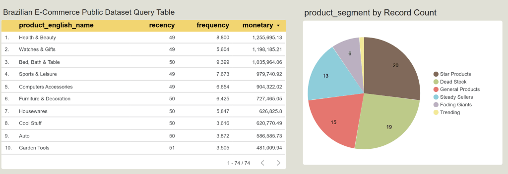
ตารางนี้แสดงค่าตัวเลขดิบ (Raw Metrics) ของสินค้า 10 อันดับแรกที่ทำรายได้สูงสุด (เรียงตามคอลัมน์ monetary จากมากไปน้อย) โดยแต่ละมิติมองได้ดังนี้ครับ:
- recency (ความสดใหม่): แสดงจำนวนวันที่หมวดหมู่นั้นๆ ไม่เกิดยอดขาย (นับถอยหลังข้ามไปหาอดีต) จะเห็นว่าสินค้า Top 10 ทั้งหมดมีค่า recency อยู่ที่ 49 – 51 วัน เท่าๆ กันหมด แปลว่าสินค้ากลุ่มนี้เป็นสินค้าที่ขายได้สม่ำเสมอ เพิ่งมีการสั่งซื้อไปไม่นานพร้อมๆ กัน
- frequency (ความถี่ในการซื้อ): จำนวนออเดอร์ที่เกิดขึ้น น่าสนใจตรงที่อันดับ 3 อย่าง Bed, Bath & Table มีความถี่สูงที่สุดในตารางถึง 9,399 ครั้ง (สูงกว่าอันดับ 1 และ 2) แต่ที่ตกมาอยู่อันดับ 3 เป็นเพราะราคาต่อชิ้นหรือยอดบิลเฉลี่ยอาจจะน้อยกว่ากลุ่มความงามครับ
- monetary (ยอดขายรวม): เป็นตัวจัดอันดับหลัก โดย Health & Beauty ยืนหนึ่งที่ 1,255,695.13 และอันดับ 10 คือ Garden Tools อยู่ที่ 481,009.94
product_segment by Record Count
กราฟนี้แสดงผลลัพธ์จากการที่คุณใช้สูตร NTILE(5) และ CASE WHEN ใน SQL เพื่อสับไพ่และจัดกลุ่มสินค้าทั้ง 74 หมวดหมู่ออกเป็นเซกเมนต์ (นับจำนวนหมวดหมู่ด้วย Record Count) ทำให้เราเห็นโครงสร้างสุขภาพของสินค้าทั้งร้านดังนี้ครับ:
- Star Products (20 หมวดหมู่): นี่คือกลุ่มที่ใหญ่ที่สุดในร้าน มีสินค้าถึง 20 หมวดหมู่ที่เป็นตัวชูโรงหลัก (ขายบ่อย เงินดี เพิ่งขายได้) ต้องรักษามาตรฐานและทำโปรโมชันต่อเนื่อง
- Dead Stock (19 หมวดหมู่): เป็นจุดระวังสำคัญเชิงธุรกิจ เพราะมีสินค้าถึง 19 หมวดหมู่ที่เข้าขั้น “ค้างคลัง” (ขายไม่ออกมานาน ยอดเงินต่ำ) ฝ่ายบริหารจัดการต้องรีบขยับตัวทำแคมเปญระบายของ
- General Products (15 หมวดหมู่): สินค้าทั่วไปที่ยอดขายและรายได้สม่ำเสมอในเกณฑ์มาตรฐานกลางๆ ของร้าน
- Steady Sellers (13 หมวดหมู่): กลุ่มสินค้าที่มาเรื่อยๆ มาเรียงๆ ยอดขายมั่นคง ไม่หวือหวาแต่พึ่งพาได้
- Fading Giants (6 หมวดหมู่): สินค้ากลุ่มอดีตเคยปัง (เคยขายดีเงินเยอะ แต่ช่วงหลังๆ ค่า recency เริ่มทิ้งห่าง ไม่มีใครสั่งซื้อ) ต้องเข้าไปรีวิวว่าเกิดจากหมดเทรนด์หรือคู่แข่งแย่งตลาด
- Trending (1 หมวดหมู่): สินค้ากระแสแรงตัวใหม่ มีอยู่ 1 หมวดหมู่ที่ยอดพุ่งขึ้นมาอย่างรวดเร็วในช่วงนี้
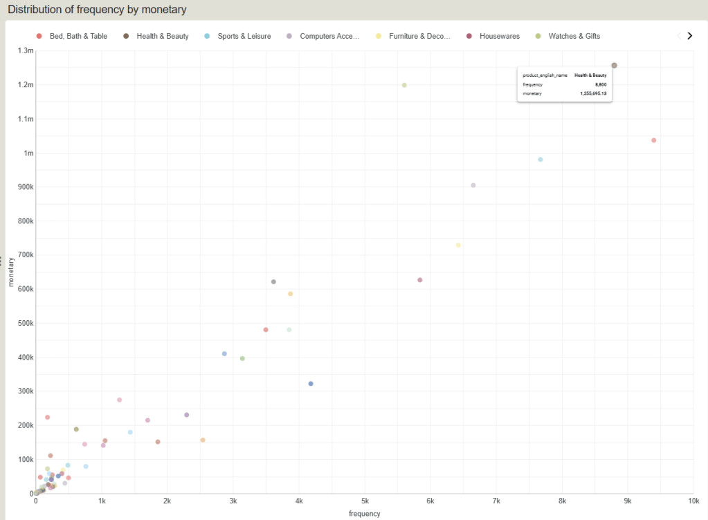
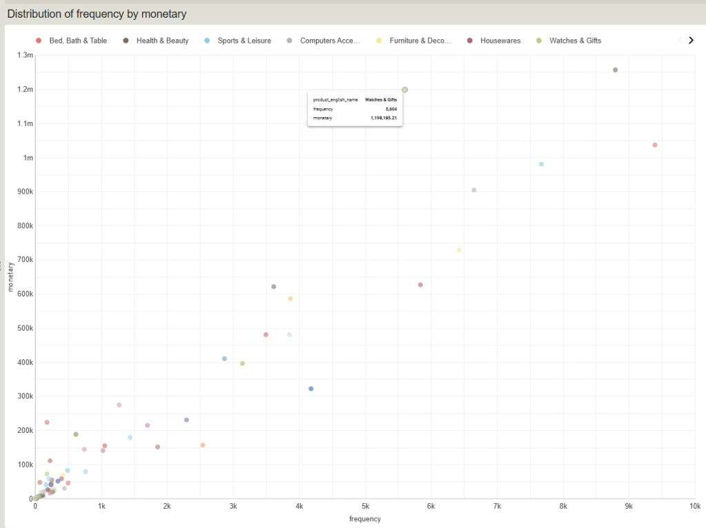
Distribution of frequency by monetary
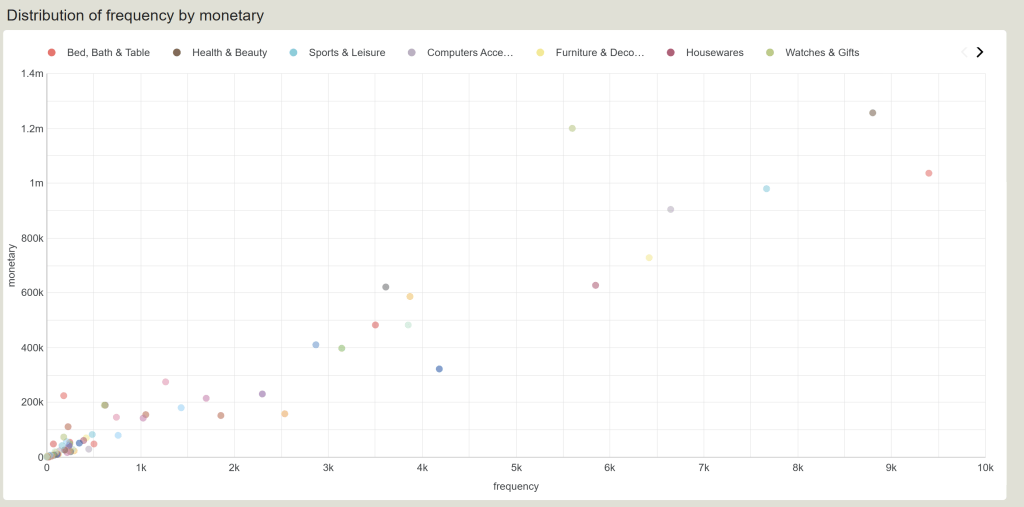
Top-performing product group
กลุ่มสินค้าท็อปฟอร์ม (ขวาเยื้องบน)
กลุ่มนี้คือจุดวงกลมที่อยู่อยู่โดดเด่นทางมุมบนขวา มีปริมาณการสั่งซื้อสูงมาก และทำเงินมหาศาล (Star Products):
- Health & Beauty : ขายดีเป็นอันดับหนึ่งแบบทิ้งห่าง จุดอยู่เกือบถึงแกน X ที่
8.8kออเดอร์ และทำเงินสูงเกือบถึง1.3M - Bed, Bath & Table : กลุ่มนี้มีปริมาณออเดอร์ (Frequency) สูงที่สุดในร้านค้าทะลุ
9.4kครั้ง แม้จะทำยอดเงินรวมรวมได้ประมาณ1Mซึ่งน้อยกว่ากลุ่มบิวตี้เล็กน้อย แต่ถือเป็นสินค้าปริมาณมาก (Volume Driver) ที่ช่วยดึงทราฟฟิกให้ร้านค้าได้ดีมาก
High Ticket product group
กลุ่มสินค้า High Ticket (ซ้ายบน – ขายน้อยแต่รวยมาก)
มองไปที่จุดสีเขียวอ่อนที่ลอยตัวอยู่สูงเด่นบริเวณกลางกราฟค่อนไปทางซ้าย:
- Watches & Gifts (จุดสีเขียวอ่อนกลางบน): หมวดหมู่นี้มีความถี่ในการสั่งซื้อเฉลี่ยปานกลางอยู่ประมาณ
5.6kครั้ง (น้อยกว่า Bed, Bath & Table เกือบครึ่งหนึ่ง) แต่กลับทำยอดขายพุ่งสูงถึง1.2Mแซงหน้ากลุ่มอื่นได้อย่างน่าทึ่ง - Insight เชิงธุรกิจ: สินค้ากลุ่มนี้มี Average Ticket Size (ราคาต่อชิ้นหรือยอดต่อบิล) ที่สูงมาก ขายไม่ต้องบ่อยแต่ได้เงินเป็นกอบเป็นกำ การทำการตลาดให้กลุ่มนี้ควรเน้นการยิงโฆษณาหาลูกค้าเกรดพรีเมียม (High-value customers) เป็นหลัก
Concentrated product group
กลุ่มสินค้ากระจุกตัว (ซ้ายล่าง – สินค้าทั่วไป/หางยาว)
จะสังเกตเห็นว่าจุดวงกลมส่วนใหญ่ในร้าน (จากทั้งหมด 74 หมวดหมู่) ไปกระจุกตัวหนาแน่นอยู่ตรงมุมซ้ายล่าง (ออเดอร์น้อยกว่า 1k ครั้ง และยอดขายต่ำกว่า 200k):
- นี่คือภาพสะท้อนของทฤษฎี Long Tail (หางยาว) ในธุรกิจ E-Commerce ครับ คือเรามีสินค้าหลากหลายประเภทมาก แต่ส่วนใหญ่ไม่ได้ทำเงินหวือหวา
- และในกลุ่มกระจุกตัวนี้เองที่มีสินค้าประเภท Dead Stock ปะปนอยู่จำนวนมาก (ตามที่เราเห็นในกราฟวงกลมรอบที่แล้วว่ามีถึง 19 หมวดหมู่)
Key Insights from Dashboard
Revenue Backbone
ภาพรวมความมั่นคงของรายได้
บริษัทสร้างยอดขายรวมได้สูงถึง 13.5 ล้าน (13,494,400.74) จาก 99,002 ออเดอร์ ครอบคลุมสินค้า 74 หมวดหมู่ โดยมีสินค้า 5 อันดับแรกที่เกาะกลุ่มทำรายได้สูงใกล้เคียงกัน (เฉลี่ยกลุ่มละ 900K – 1.3M) ชี้ให้เห็นว่าบริษัทมีการกระจายความเสี่ยงของรายได้ที่ดี ไม่ได้พึ่งพาพอร์ตสินค้าใดสินค้าหนึ่งจนเกินไป
Volume vs. Value Drivers
โมเดลการสร้างรายได้ที่แตกต่าง
- จากกราฟ Scatter Plot ด้านล่าง เผยให้เห็นรูปแบบการทำเงินของสินค้ากลุ่มยักษ์ใหญ่ที่ต่างกันอย่างชัดเจน:
Volume Driver
กลุ่มเน้นปริมาณ
- เช่น หมวด Bed, Bath & Table ทำสถิติจำนวนออเดอร์สูงสุดในร้านค้าทะลุ 9,399 ครั้ง (กวาดส่วนแบ่งไป 23.2% ในกลุ่มตัวท็อป) แม้ยอดเงินรวมจะอยู่อันดับ 3 แต่เป็นกลุ่มที่สร้างทราฟฟิกและแรงกระเพื่อมในระบบได้ดีที่สุด
Value Driver
กลุ่มเน้นราคา/กำไรต่อชิ้น
- เช่น หมวด Watches & Gifts มีจำนวนออเดอร์ปานกลางที่ 5,604 ครั้ง (น้อยกว่ากลุ่มแรกเกือบครึ่งหนึ่ง) แต่กลับปั๊มรายได้รวมได้สูงถึง 1.19 ล้าน ขึ้นแท่นเป็นอันดับ 2 ของร้านเนื่องจากราคาต่อบิลสูงมาก
The Ultimate Star
กลุ่มแชมป์พรีเมียม
- หมวด Health & Beauty เป็นกลุ่มเดียวที่ผสานจุดเด่นทั้งสองมิติได้อย่างสมบูรณ์แบบ คว้าแชมป์อันดับ 1 ทั้งในแง่ยอดขายรวม (1.25 ล้าน) และส่วนแบ่งการตลาดกลุ่มตัวท็อป (28.1%)
Inventory Red Flag
วิกฤตการณ์สินค้าค้างคลัง
- แม้หน้าบ้านจะขายดี แต่เมื่อพิจารณาสุขภาพข้อมูลหลังบ้านจากกราฟวงกลม product_segment จะพบว่าบริษัทมีสินค้ากลุ่ม Dead Stock ถึง 19 หมวดหมู่ ซึ่งมีสัดส่วนใหญ่เป็นอันดับที่ 2 ของร้านค้า (เกือบเท่ากลุ่ม Star Products ที่มี 20 หมวดหมู่) สินค้าเหล่านี้มียอดขายต่ำและไม่มีการเคลื่อนไหวมานาน ซึ่งหมายถึงต้นทุนจมในการบริหารจัดการคลังสินค้าที่กำลังสูงขึ้นเรื่อยๆ
Business Recommendations
Cross-Category Bundling
กลยุทธ์ “จับคู่กู้ชีพ”
- นำหมวดหมู่สินค้ากลุ่ม Dead Stock (19 หมวด) หรือกลุ่ม General Products (15 หมวด) ที่จมอยู่ในโซนซ้ายล่างของกราฟ Scatter Plot มาจัดแคมเปญมัดรวม (Bundling) ร่วมกับสินค้ากลุ่มที่เป็นแม่เหล็กดึงดูดลูกค้าอย่าง Star Products (20 หมวด) เช่น การซื้อครีมบำรุงผิวในหมวด Health & Beauty พ่วงซื้อของตกแต่งบ้านชิ้นเล็กในราคาพิเศษ เพื่อเร่งระบายสินค้าค้างคลัง ขยายพื้นที่โกดัง และเพิ่มอัตราการหมุนเวียนของสินค้า (Inventory Turnover)
High-Value
การตลาดแบบเจาะจงกลุ่ม High-Value สำหรับกลุ่มสินค้าราคาสูง
- สินค้าหมวด Watches & Gifts พิสูจน์แล้วว่าขายน้อยแต่ได้เงินเยอะ (High Ticket Size) ทีมการตลาดไม่ควรเสียเงินยิงแคมเปญหว่านแบบแมส (Mass Marketing) แต่ควรใช้ Data ลูกค้ามาทำ Personalized Marketing คัดเฉพาะกลุ่มที่มีกำลังซื้อสูงเพื่อเสนอขายสินค้ากลุ่มนี้โดยเฉพาะ ซึ่งจะช่วยลดต้นทุนค่าโฆษณา (CAC) แต่สร้างผลตอบแทนสูงสุด (ROAS)
Subscription / Retention Model
กลยุทธ์ “ซื้อซ้ำ” สำหรับหมวดหมู่ทราฟฟิกสูง
- สำหรับหมวด Health & Beauty และ Bed, Bath & Table ที่ลูกค้ามีการสั่งซื้อซ้ำและมีความถี่สูงมาก ควรออกแบบโปรแกรมรักษาฐานลูกค้า (Loyalty Program) หรือระบบบอกรับสมาชิก (Subscription) เช่น การส่งซื้อสินค้าความงามอัตโนมัติทุกๆ 1-2 เดือน พร้อมมอบส่วนลด เพื่อล็อกตัวลูกค้าให้อยู่กับแพลตฟอร์มในระยะยาวและเพิ่ม Lifetime Value (LTV)
- การทำความสะอาดคลังสินค้าและวินิจฉัยกลุ่ม Fading Giants: สำหรับสินค้า 6 หมวดหมู่ที่อยู่ในกลุ่ม Fading Giants (อดีตเคยเป็นยักษ์ใหญ่ขายดีแต่ปัจจุบันเริ่มเงียบเหงา) ทีมบริหารผลิตภัณฑ์ (Product Owner) ต้องรีบเข้าไปสืบหาต้นตอทันทีว่าเกิดจากสินค้าหมดเทรนด์, มีคู่แข่งเข้ามาตัดราคา หรือเกิดปัญหา Supply Chain เพื่อจะได้ปรับทิศทาง ถ้ารีเทิร์นกลับมาไม่ได้ จะได้วางแผนทำ Clearance Sale ควบคู่ไปกับกลุ่ม Dead Stock เพื่อเอาเงินสดกลับมาหมุนเวียนในบริษัทให้เร็วที่สุดครับ
Conclusion
การดำเนินโปรเจกต์ Product Performance Analytics บนข้อมูล Olist e-Commerce ในครั้งนี้ ประสบความสำเร็จในการเปลี่ยนข้อมูลดิบจำนวนมหาศาลในระบบหลังบ้าน ให้กลายเป็นเข็มทิศนำทางธุรกิจที่ชัดเจน ผ่านการผสานพลังเทคโนโลยีระหว่าง BigQuery SQL และ Looker Studio
จากผลลัพธ์การวิเคราะห์พบว่า โครงสร้างรายได้รวมจำนวน 13.5 ล้าน ของบริษัท มีเสถียรภาพค่อนข้างดีเนื่องจากมีการกระจายความเสี่ยงไปในหลายหมวดหมู่ โดยมีสินค้ากลุ่ม Health & Beauty ทำหน้าที่เป็น ‘The Ultimate Star’ คว้าแชมป์ทั้งด้านยอดขายและปริมาณคำสั่งซื้อ อย่างไรก็ตาม ข้อมูลได้สะท้อนให้เห็นมิติการสร้างรายได้ที่แตกต่างกันอย่างชัดเจนของสินค้าตัวท็อป โดยหมวด Bed, Bath & Table ทำหน้าที่เป็น Volume Driver (เน้นสร้าง Traffic และความถี่สูงถึง 9.4K ครั้ง) ขณะที่หมวด Watches & Gifts ทำหน้าที่เป็น Value Driver (เน้นราคาต่อชิ้นสูง ขายน้อยแต่สร้าง Margin มหาศาล)
แต่ในขณะเดียวกัน ข้อมูลหลังบ้านได้จุดสัญญาณเตือนภัย (Red Flag) ที่สำคัญ คือการพบสินค้ากลุ่ม Dead Stock สูงถึง 19 หมวดหมู่ ซึ่งมีสัดส่วนใหญ่เป็นอันดับที่ 2 ของร้านค้า ซึ่งหากปล่อยทิ้งไว้จะกลายเป็นต้นทุนจมและลดประสิทธิภาพการทำกำไรของบริษัทในระยะยาว
เพื่อตอบสนองต่อสิ่งเหล่านี้ โปรเจกต์จึงได้นำเสนอข้อเสนอแนะเชิงกลยุทธ์ 4 แนวทางหลัก คือ
- กลยุทธ์ Cross-Category Bundling จับคู่สินค้าค้างคลังพ่วงไปกับสินค้าขายดีเพื่อระบายสต็อก
- การทำ Personalized Marketing เจาะกลุ่มกำลังซื้อสูงเพื่อดันสินค้า High Ticket
- การสร้าง Subscription/Retention Model ล็อกตัวลูกค้าในกลุ่มสินค้าซื้อซ้ำ
- การทำคัดกรองวินิจฉัยกลุ่ม Fading Giants เพื่อดึงกระแสเงินสดกลับมาให้เร็วที่สุด
โดยสรุปแล้ว โปรเจกต์นี้ไม่ได้เป็นเพียงแค่การทำรายงานสรุปผลตัวเลข (Descriptive Analytics) แต่เป็นการส่งมอบเครื่องมือตัดสินใจทางธุรกิจแบบเชิงรุก (Prescriptive Analytics) ที่ช่วยให้องค์กรพลิกวิกฤตทางคลังสินค้าให้กลายเป็นโอกาสในการสร้างยอดขาย และขับเคลื่อนธุรกิจ e-Commerce ให้เติบโตอย่างยั่งยืนด้วยการใช้ข้อมูลเป็นศูนย์กลาง (Data-Driven Organization) อย่างแท้จริง
หวังว่าบทความนี้จะเป็นประโยชน์ในเรื่องการใช้ SQL, Google Big Query, Google Sheet, Data Studio และทำให้เข้าใจเรื่อง Key Insight และ Business Recommendation ด้วยครับ