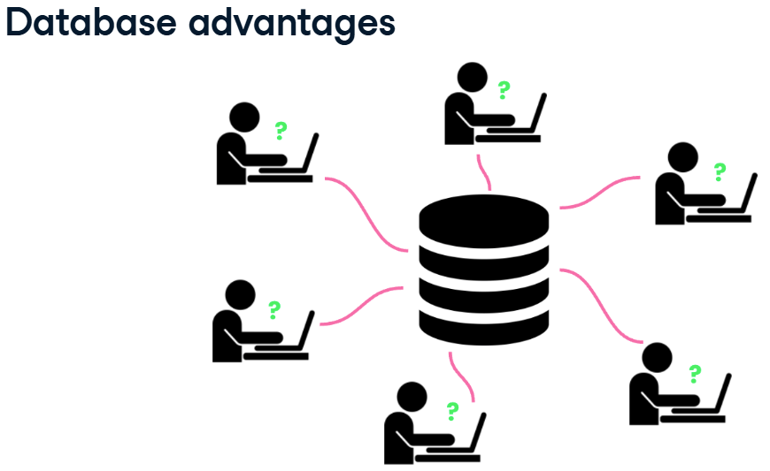
เป็นบทความสำหรับการวิเคราะห์ข้อมูลโดยโปรแกรม R เพื่อที่จะหากลุ่มลูกค้าที่จะเก็บข้อมูลมาว่าลูกค้ากลุ่มไหน ควรออกแบบ Campaign อะไรที่จะสามารถตอบโจทย์และบอกได้ว่าลูกค้ากลุ่มไหนควรแนะนำให้เพิ่มบริการหรือลดบริการ
เนื่องจากปัจจุบันการสูญเสียลูกค้ากันเยอะขึ้น ในหลายๆ รูปแบบจึงอยากหาสาเหตุว่าลูกค้ากลุ่มไหนควรที่จะทำ Campaign อะไรให้เพื่อฟื้นฟูความสัมพันธ์กับลูกค้าเหล่านั้น โดยการสร้าง RFM Feature Engineering ขึ้นมาจากข้อมูลที่มี
RFM Feature Engineering คือมันคือการแปลงประวัติการซื้อของลูกค้า (ที่เป็นข้อมูลดิบ) ให้กลายเป็น 3 คำดังนี้ Recency, Frequency and Monetary เพื่อนำไปใช้สำหรับการวิเคราะห์การตลาด จากข้อมูลดิบของการซื้อขายครับ คือ การเปลี่ยนข้อมูล Transaction ที่เข้าใจยาก ให้กลายเป็น 3 คอลัมน์ใหม่ที่เข้าใจง่าย เพื่อใช้วิเคราะห์พฤติกรรมลูกค้าครับ
โดย 3 Features ที่เราสร้างขึ้นมานั้นย่อมาจาก:
- R = Recency (ความสดใหม่): ลูกค้าซื้อครั้งล่าสุดเมื่อไหร่? (เช่น 10 วันที่แล้ว)
- F = Frequency (ความถี่): ลูกค้าซื้อบ่อยแค่ไหน? (เช่น 5 ครั้ง)
- M = Monetary (มูลค่าการใช้จ่าย): ลูกค้าใช้เงินไปทั้งหมดเท่าไหร่? (เช่น 8,000 บาท)
Data Analyst with R
- Install Library
- Read data
- Definition of Column
- Data Cleaning
- Create RFM Feature Engineering
- K-Means (Customer Segmentation)
- Segment Profiling
- Storytelling and Visualization
- Recommended Campaign
- Export Data for search cluster in excel
Install Library
ก่อนที่จะเริ่มต้นวิเคราะห์ข้อมูล ก็เริ่มต้นด้วยการ Download Library เพื่อที่จะสามารถใช้ Function ต่างๆได้หลากหลายขึ้น เช่น tidyverse และ readxl ก่อน
Install readxl
- install.packages(“readxl”) download มาเพื่อสามารถอ่านข้อมูลจากไฟล์ Excel ได้
- library(readxl)
install.packages("readxl")
library(readxl)
Install tidyverse
- install.packages(“tidyverse”) Download มาเพื่อสามารถวิเคราะห์ข้อมูลทั้งหมดได้ ไม่ว่าจะ dplyr และ ggplot
- library(tidyverse)
install.packages("tidyverse")
library(tidyverse)
- หลังจาก run code จะสามารถดึงอุปกรณ์ในการช่วยวิเคราะห์ข้อมูลได้ตามรูปด้านล่าง

Read data
Read excel
- สามารถอ่าน File Excel ชื่อ Online Retail.xlsx แล้วเลือก Sheet ที่ต้องการวิเคราะห์ข้อมูล ซึ่งก็คือ Sheet ที่ 1 ของไฟล์นี้
## read file from excel
retail_data <- read_excel("Online Retail.xlsx", sheet = 1)
View(retail_data)
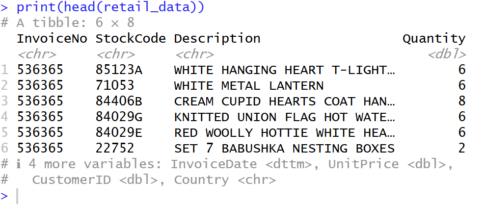
Head data
- เลือก head มาเพื่อที่จะดูข้อมูล Column ของมีข้อมูลแถวบนเป็นยังไงบ้าง
## show head data
print("Example:")
print(head(retail_data))
Glimpse
glimpse จะแสดงโครงสร้างข้อมูลของ data frame จะสามารถรู้ได้ว่ามีคอลัมน์อะไรบ้าง, แต่ละคอลัมน์มีชนิดข้อมูล (Data Type) อะไร, และมีข้อมูลตัวอย่างหน้าตาเป็นอย่างไร ดังรูป
## show data structure
print("data structure:")
glimpse(retail_data)

Definition of Column
เราเริ่มจากการดูข้อมูลเบื้องต้นก่อนว่า แต่ละ Column คืออะไรบ้าง
InvoiceNo
- InvoiceNo คือ (เลขที่ใบแจ้งหนี้)
- เป็นรหัสที่ใช้ “จัดกลุ่ม” สินค้าที่ถูกซื้อในธุรกรรม (Transaction) เดียวกัน
- จากตัวอย่าง InvoiceNo “536365” มีหลายแถว หมายความว่า ลูกค้าคนนี้สั่งสินค้าหลายอย่างในใบเสร็จใบเดียวกัน
StockCode
- StockCode คือ รหัสสินค้า
- รหัสเฉพาะของสินค้าแต่ละชิ้น (คล้ายกับ SKU)
Description
- Description คือ รายละเอียดสินค้า
- ชื่อหรือคำอธิบายของสินค้า (เช่น “WHITE HANGING HEART T-LIGHT HOLDER”)
Quantity
- Quantity คือ จำนวนสินค้า
- จำนวนสินค้า ชิ้นนั้น ที่ถูกสั่งซื้อในใบเสร็จนี้
- ข้อควรระวัง: ในข้อมูลชุดนี้ บางครั้งค่า Quantity อาจ ติดลบ ซึ่งหมายถึงการยกเลิก (Cancellation) หรือการคืนสินค้า (Return)
InvoiceDate
- InvoiceDate คือ วันที่สั่งซื้อ
- วันที่และเวลาที่ธุรกรรมนั้นเกิดขึ้น (เช่น 2010-12-01 08:26:00)
UnitPrice
- UnitPrice คือ ราคาต่อหน่วย
- ราคาของสินค้าชิ้นนั้น 1 หน่วย (เช่น 2.55)
CustomerID
- CustomerID คือ รหัสลูกค้า
- รหัสประจำตัวของลูกค้าที่ทำการสั่งซื้อ (เช่น 17850)
- ข้อควรระวัง: ในข้อมูลชุดนี้ บางแถวอาจไม่มี CustomerID (เป็นค่าว่าง หรือ NA) ซึ่งหมายถึงการซื้อแบบที่ไม่ได้ล็อกอิน (Guest)
Country
- Country คือ ประเทศ
- ประเทศที่ลูกค้าคนนั้นอาศัยอยู่
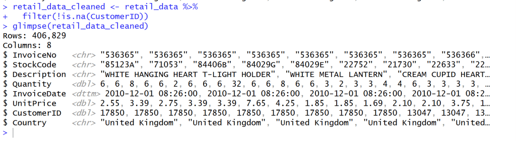
Data Cleaning
Clean missing CustomerID value
- หลังจากสำรวจข้อมูลแล้วเห็นว่าข้อมูล CustomerID บาง Column ข้อมูลไม่ครบ จึงทำลบแถวที่ข้อมูลไม่ครบของ CustomerID จาก Rows 541,909 เหลือ 406,829 = 133,820 Rows
- ใช้ Code นี้เพื่อที่จะสามารถข้อมูลที่ยังไม่สมบูรณ์ เช่น ที่ Column Customer ID ออกโดยใช้ filter(!is.na(CustomerID)) คือ ใช้ column CustomerID ‘ไม่’ ( ! ) ‘เป็นค่าว่าง’ ( is.na )”
## Clean missing data
retail_data_cleaned <- retail_data %>%
  filter(!is.na(CustomerID))
glimpse(retail_data_cleaned)
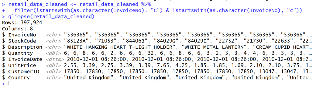
Cancel transaction that have C before Invoice NO.
- หลังจากสำรวจข้อมูลใน Column Invoice NO. แล้วพบว่า Column ที่ Invoice NO. ถูก Cancel จะมีตัว C อยู่ข้างหน้า Invoice เหล่านั้น
- เราจึงต้องกรอง Invoice ที่ขึ้นต้นด้วย C และ c ออกไปเพื่อเหลือแค่ลูกค้าที่สั่ง Order กับเราจริงๆ โดยไม่ยกเลิก Order
## Cancel transaction that have C before Invoice NO.
retail_data_cleaned <- retail_data_cleaned %>%
  filter(!startsWith(as.character(InvoiceNo), "C") & !startsWith(as.character(InvoiceNo), "c"))
glimpse(retail_data_cleaned)
Manage Quantity and UnitPrice
- กรองค่าที่ Quantity และ UnitPrice ที่น้อยกว่า 0 ออกเพื่อให้ข้อมูลถูกต้อง
## manage Quantity and UnitPrice
retail_data_cleaned <- retail_data_cleaned %>%
  filter(Quantity > 0 & UnitPrice > 0)
glimpse(retail_data_cleaned)

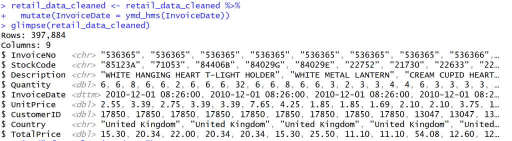
Create Column TotalPrice
- เพิ่ม Column TotalPrice เพื่อคำนวณราคาของ Quantity * Unitprice จะได้รู้ปริมาณ * ราคาของสินค้าทั้งแถว
- แล้วจะมี Column ชื่อ Total Price ตามรูปด้านล่าง
## Create Column Totalprice
retail_data_cleaned <- retail_data_cleaned %>%
  mutate(TotalPrice = Quantity * UnitPrice)
retail_data_cleaned
glimpse(retail_data_cleaned)

Change InvoiceDate into Date/time
- เปลี่ยนวันที่ในข้อมูลให้กลายเป็นวันที่สามารถบอกเวลาได้ ให้เป็นรูปแบบเดียวกัน
## Change InvoiceDate into Date/time
retail_data_cleaned <- retail_data_cleaned %>%
  mutate(InvoiceDate = ymd_hms(InvoiceDate))
glimpse(retail_data_cleaned)
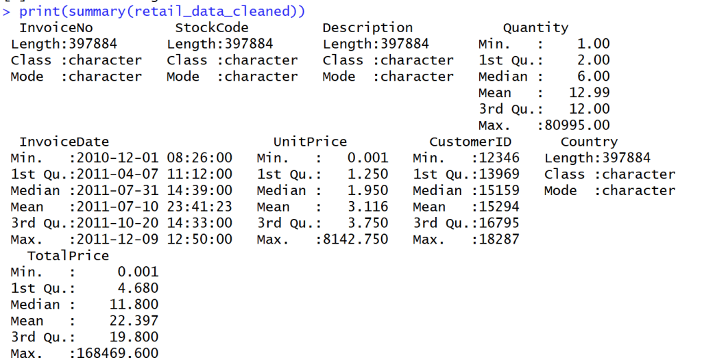
Summary Data
- สรุปข้อมูลออกมาได้ดังนี้
- Summary ได้เฉพาะ Column ที่เป็นปริมาณ
Create RFM Feature Engineering
Snapshot Date
- หาวันที่ max ที่สุดของ data นี้ด้วยตัวแปร Snapshot
## snapshot Date
## use next date for last day from data
snapshot_date <- max(retail_data_cleaned$InvoiceDate) + days(1)
snapshot_date

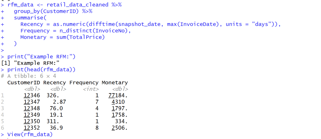
calculate RFM
- สร้างแถว Recency, Frequency and Monetary
เพื่อจะได้รับตัวแปรช่วยให้รู้ได้ว่าลูกค้ากลุ่มไหนซื้อสินค้าเรา วันล่าสุดเท่าไร ความถี่เท่าไร และค่าใช้จ่ายเท่าไร
- Monetary (M): ยอดใช้จ่ายทั้งหมด
- Recency (R): จำนวนวันที่ผ่านไปนับจากการซื้อครั้งล่าสุด
- Frequency (F): จำนวนธุรกรรมทั้งหมด
## create new rfm_data with Recency, Frequency and Monetary
rfm_data <- retail_data_cleaned %>%
  group_by(CustomerID) %>%
  summarise(
    Recency = as.numeric(difftime(snapshot_date, max(InvoiceDate), units = "days")),
    Frequency = n_distinct(InvoiceNo),
    Monetary = sum(TotalPrice)
  )
print("Example RFM:")
print(head(rfm_data))
View(rfm_data)
K-Means (Customer Segmentation)
K-Means
K-Means คือการแบ่งฐานลูกค้าทั้งหมดของคุณออกเป็นกลุ่มย่อยๆ (Segments) โดยที่คนในกลุ่มเดียวกันจะมีพฤติกรรมหรือคุณลักษณะที่คล้ายกัน แต่จะแตกต่างจากคนในกลุ่มอื่นอย่างชัดเจน
ตัวอย่างผลลัพธ์ที่คาดว่าจะได้รับมีดังนี้
เมื่อใช้อัลกอริทึม K-Means (สมมติว่าเราตั้งค่า $K=4$) เราอาจจะได้กลุ่มลูกค้า 4 กลุ่ม เช่น:
- กลุ่มลูกค้าชั้นดี (High-Value): ซื้อบ่อย (F สูง), ยอดซื้อสูง (M สูง), และเพิ่งซื้อไปไม่นาน (R ต่ำ)
- กลุ่มลูกค้าที่กำลังจะหาย (At-Risk): เคยซื้อเยอะและบ่อย (F, M สูง) แต่ไม่กลับมาซื้อนานแล้ว (R สูง)
- กลุ่มลูกใหม่ (New Customers): เพิ่งซื้อครั้งแรก (F, M ต่ำ) และซื้อล่าสุด (R ต่ำ)
- กลุ่มลูกค้าทั่วไป (Standard): ซื้อประปราย ยอดซื้อปานกลาง
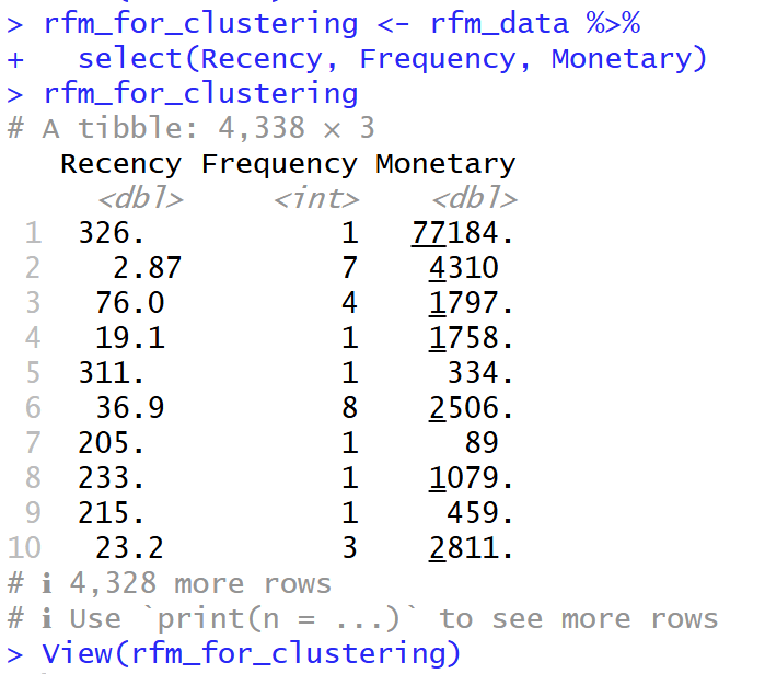
Prepare Data for K-Means (choose specific column R, F, M)
- เลือกเฉพาะ Column R, F และ M จาก ตัวแปร rfm_data มาอยู่ในตัวแปร rfm_for_clustering เพื่อที่จะสามารถศึกษาข้อมูลต่อได้
## Prepare data for K-Means (Choose specially R, F, M )
rfm_for_clustering <- rfm_data %>%
  select(Recency, Frequency, Monetary)
rfm_for_clustering
View(rfm_for_clustering)
Manage with Outlier
- เนื่องจาก Frequency and Monetary มีการเบ้ขวาของข้อมูล จึงใส่ค่า log เพื่อลดการคลาดเคลื่อนของข้อมูล (Outlier)
- การเบ้ขวาของข้อมูล คือ ข้อมูลส่วนใหญ่กระจุกตัวอยู่ที่ฝั่งค่าน้อยกว่า
## manage with Outliers
## column Frequency and Monetary have right skewed
## Log Transformation to reduce Outlier
rfm_log <- rfm_for_clustering %>%
  mutate(
    Recency_log = log(Recency + 1), # +1 เพื่อหลีกเลี่ยง log(0)
    Frequency_log = log(Frequency + 1),
    Monetary_log = log(Monetary + 1)
  ) %>%
  select(Recency_log, Frequency_log, Monetary_log)
glimpse(rfm_log)

Standardize
- Scale( ) ใน R เป็นเครื่องมือที่สำคัญมากสำหรับการ “Standardization” หรือ “การปรับสเกลข้อมูล” ครับ
- Centering (การปรับศูนย์): มันจะนำค่าในคอลัมน์นั้นไป ลบด้วยค่าเฉลี่ย (Mean) ของคอลัมน์ ผลลัพธ์คือ คอลัมน์ใหม่นี้จะมี ค่าเฉลี่ย = 0
- Scaling (การปรับสเกล): จากนั้น มันจะนำค่าที่ถูก Centered แล้ว ไป หารด้วยส่วนเบี่ยงเบนมาตรฐาน (Standard Deviation – SD) ของคอลัมน์นั้น ผลลัพธ์คือ คอลัมน์ใหม่นี้จะมี Standard Deviation = 1
## Standardize
## make average to be 0 and S.e. to be 1
rfm_scaled <- scale(rfm_log)
print("Adapt with propotion:")
print(head(rfm_scaled))

View(rfm_scaled)

Elbow method
- Elbow Method คือเทคนิคที่นิยมใช้เพื่อช่วยตัดสินใจว่า “จำนวนกลุ่ม (K) ที่เหมาะสมที่สุด” ควรจะเป็นเท่าไหร่ สำหรับการทำ Clustering, โดยเฉพาะกับ K-Means
## Elbow method to find K that fit to data
wss <- (nrow(rfm_scaled)-1) * sum(apply(rfm_scaled, 2, var))
for (i in 2:10) { # ทดสอบ k ตั้งแต่ 2 ถึง 10
  wss[i] <- sum(kmeans(rfm_scaled, centers = i)$withinss)
}
wss
WSS
wss คือ มันคือการคำนวณว่าข้อมูลทั้งหมดในกลุ่มนั้นๆ อยู่ “กระจัดกระจาย” หรือ “เกาะกันแน่น” แค่ไหน โดยวัดจากจุดศูนย์กลาง (Centroid) ของกลุ่ม
ค่า WSS ต่ำ = ดีมาก
- หมายความว่า จุดข้อมูลต่างๆ อยู่ “ใกล้” กับจุดศูนย์กลางของกลุ่มมันมาก
- แปลว่ากลุ่มนั้น “เกาะกันแน่น” (Dense) และมีความแปรปรวนภายในกลุ่มต่ำ
ค่า WSS สูง = ไม่ดี
- หมายความว่า จุดข้อมูลต่างๆ อยู่ “ไกล” จากจุดศูนย์กลางกลุ่ม
- แปลว่ากลุ่มนั้น “กระจัดกระจาย” (Sparse) และมีความแปรปรวนภายในกลุ่มสูง
## Calculate Within-Cluster Sum of Squares (WSS)
wss <- (nrow(rfm_scaled)-1) * sum(apply(rfm_scaled, 2, var))
for (i in 2:10) { # ทดสอบ k ตั้งแต่ 2 ถึง 10
  wss[i] <- sum(kmeans(rfm_scaled, centers = i)$withinss)
}
wss
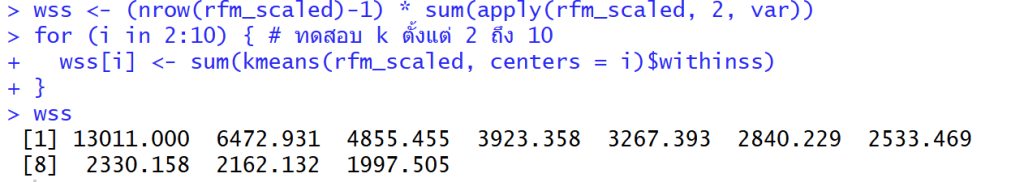
วิธีดู “Elbow method” คือการดูว่า WSS “ลดลง” ไปเท่าไหร่ในแต่ละก้าว และมองหาจุดที่ “อัตราการลดลง” มันเริ่มน้อยลง (กราฟเริ่มแบน)
- K=1 -> 2: ลดลง 13011.0 – 6472.9 = 6538.1 (ลดลงเยอะมาก)
- K=2 -> 3: ลดลง 6472.9 – 4855.5 = 1617.4 (ยังลดลงเยอะ)
- K=3 -> 4: ลดลง 4855.5 – 3923.4 = 932.1 (เริ่มลดน้อยลง อย่างชัดเจน)
- K=4 -> 5: ลดลง 3923.4 – 3267.4 = 656.0
- K=5 -> 6: ลดลง 3267.4 – 2840.2 = 427.2
- K=6 -> 7: ลดลง 2840.2 – 2533.5 = 306.7 (หลังจากนี้คือลดลงน้อยมาก)
- K=7 -> 8: ลดลง 2533.5 – 2330.2 = 203.3
- K=8 -> 9: ลดลง 2330.2 – 2162.1 = 168.1
- K=9 -> 10: ลดลง 2162.1 – 1997.5 = 164.6
จึงใช้ k = 4
K=3 -> 4: ลดลง 4855.5 – 3923.4 = 932.1 (เริ่มลดน้อยลง อย่างชัดเจน)
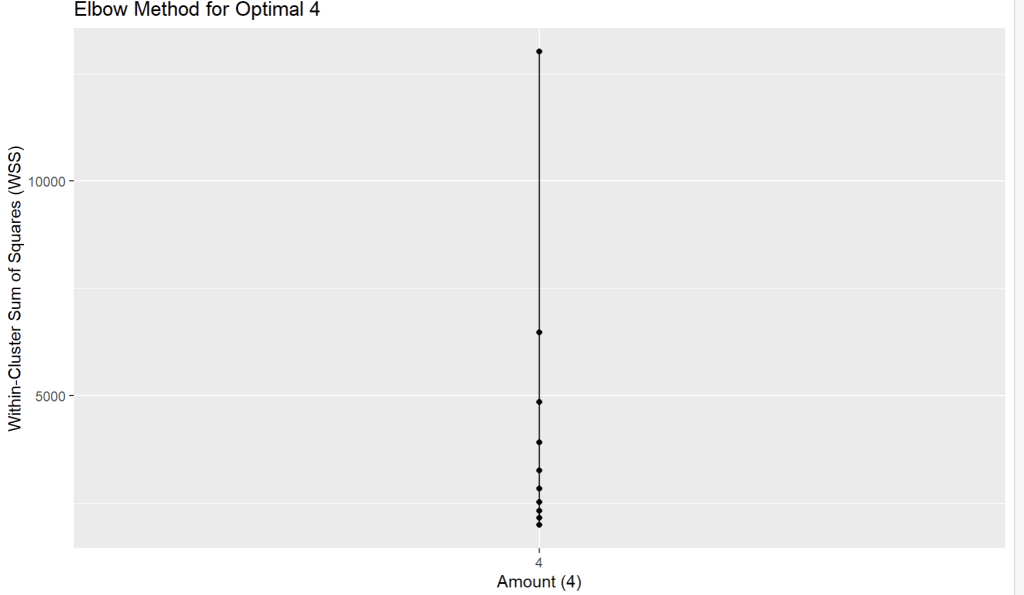
Create dataframe for plot graph and plot graph with ggplot
- สร้างกราฟเพื่อดูว่าข้อมูลไหนห่างกันน้อยที่เมื่อเทียบกับด้านคือ K = 4
## create dataframe for plot graph
elbow_data <- data.frame(k = 1:10, wss = wss)

## plot graph with ggplot
print(
  ggplot(elbow_data, aes(x = 4, y = wss)) +
    geom_line() +
    geom_point() +
    scale_x_continuous(breaks = 1:10) +
    labs(title = "Elbow Method for Optimal 4",
         x = "Amount (4)",
         y = "Within-Cluster Sum of Squares (WSS)")
)
K-Means clustering
## K-Means clustering
set.seed(42) # make result same
k_optimal <- 4
kmeans_result <- kmeans(rfm_scaled, centers = k_optimal, nstart = 25)
- set.seed(42) เพื่อให้ข้อมูลคงค่าเดิมเสมอทุกครั้งที่ Run model
- centers = k_optimal: บอก K-Means ว่า “ให้แบ่งกลุ่มข้อมูลนี้ออกเป็น 4 กลุ่มนะ” (โดยอ้างอิงค่าจากตัวแปร k_optimal ที่เราตั้งไว้)
- nstart = 25: บอก K-Means ว่า “ให้ลองสุ่มจุดเริ่มต้น 25 ครั้ง แล้วเลือกเอาครั้งที่ได้ผลลัพธ์ดีที่สุด (คือได้ค่า WSS ต่ำที่สุด)” มาเป็นคำตอบสุดท้าย (ช่วยให้ได้ผลลัพธ์ที่ดีและเสถียรขึ้น)
Segment Profiling
Calculate average of R, F, M with Cluster
- คำนวณค่าเฉลี่ยตามกลุ่ม Cluster เรียงตามค่าใช้จ่ายจากน้อยไปมาก
## Calculate average of R, F, M with Cluster
segment_profile <- rfm_data %>%
  group_by(Cluster) %>%
  summarise(
    Avg_Recency = mean(Recency),
    Avg_Frequency = mean(Frequency),
    Avg_Monetary = mean(Monetary),
    Count = n() # Number of Customers
  ) %>%
  arrange(Avg_Monetary) # arrange with expense

print("Profie seperate of group R, F, M:")
print(segment_profile)

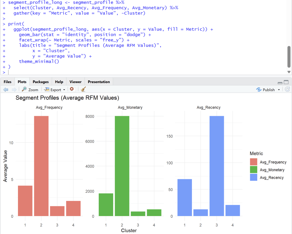
Storytelling and Visualization
- Bar charts to compare average R, F, M of each segment
## Bar charts to compare average R, F, M of each segment

segment_profile_long <- segment_profile %>%
  select(Cluster, Avg_Recency, Avg_Frequency, Avg_Monetary) %>%
  gather(key = "Metric", value = "Value", -Cluster)

print(
  ggplot(segment_profile_long, aes(x = Cluster, y = Value, fill = Metric)) +
    geom_bar(stat = "identity", position = "dodge") +
    facet_wrap(~ Metric, scales = "free_y") +
    labs(title = "Segment Profiles (Average RFM Values)",
         x = "Cluster",
         y = "Average Value") +
    theme_minimal()
)
Analyst from four cluster
Cluster 1
Cluster 1: ลูกค้าทั่วไป (กำลังจะห่าง)
- Frequency (ความถี่): ปานกลาง (Avg. ~4)
- Monetary (ยอดใช้จ่าย): ปานกลาง (Avg. ~1900)
- Recency (ซื้อล่าสุด): ค่อนข้างนาน (Avg. ~70 วัน)
- สรุป: กลุ่มนี้เคยซื้อค่อนข้างดี แต่เริ่มหายไปนานแล้ว (70 วัน) อาจต้องการการกระตุ้นเตือนให้กลับมา
Cluster 2
Cluster 2: 🏆 ลูกค้าชั้นดี (Best Customers / VIP)
- Frequency (ความถี่): สูงที่สุด (Avg. ~14)
- Monetary (ยอดใช้จ่าย): สูงที่สุด (Avg. ~8000)
- Recency (ซื้อล่าสุด): ต่ำที่สุด (Avg. ~10 วัน)
- สรุป: นี่คือกลุ่มที่ดีที่สุดของคุณ ซื้อบ่อย, จ่ายหนัก, และเพิ่งซื้อไปไม่นาน กลุ่มนี้คือกลุ่มที่ต้องรักษาไว้ให้ดีที่สุด (Loyalty Program, สิทธิพิเศษ)
Cluster 3
Cluster 3: 😥 ลูกค้าที่หายไปแล้ว (Lost Customers)
- Frequency (ความถี่): ต่ำ (Avg. ~1.5)
- Monetary (ยอดใช้จ่าย): ต่ำที่สุด (Avg. ~300)
- Recency (ซื้อล่าสุด): สูงที่สุด (Avg. ~180 วัน)
- สรุป: กลุ่มนี้ซื้อน้อย จ่ายน้อย และที่สำคัญคือ ไม่กลับมาซื้อนานมากแล้ว (เกือบ 180 วัน) การดึงลูกค้ากลุ่มนี้กลับมาอาจต้องใช้โปรโมชั่นที่แรงมาก (Win-back campaign)
Cluster 4
Cluster 4: ✨ ลูกค้าใหม่ (New Customers)
- Frequency (ความถี่): ต่ำ (Avg. ~2)
- Monetary (ยอดใช้จ่าย): ต่ำ (Avg. ~600)
- Recency (ซื้อล่าสุด): ต่ำ (Avg. ~20 วัน)
- สรุป: กลุ่มนี้เพิ่งเข้ามาซื้อได้ไม่นาน (Recency ต่ำ) แต่ยังซื้อไม่บ่อยและยังจ่ายไม่เยอะ (F, M ต่ำ) เป้าหมายคือต้องกระตุ้น (Nurture) ให้พวกเขากลายเป็น Cluster 2 ในอนาคต
Recommended Campaign
| Cluster | Segment | จำนวนลูกค้า | กลยุทธ์ที่แนะนำ |
| 1 | At-Risk | 1158 | ดึงกลับ ส่งแคปเปญ We miss you |
| 2 | Champions | 723 | รักษา มอบรางวัล loyalty ให้สิทธิ์ VIP |
| 3 | Lost | 1579 | ไม่ต้องโฟกัส |
| 4 | Potential | 878 | พัฒนา กระตุ้นการซื้อถัดไป |
Export Data for search cluster in excel
install.packages("writexl")
library(writexl)
write_xlsx(rfm_data, "rfm_data_export.xlsx")
- install package write excel เพื่อที่จะสามารถนำไปดูต่อใน Excel ได้ว่า Customer ID ควรสร้าง Campaign อะไร
- Loyalty for VIP, We miss you สำหรับลูกค้าที่จะหายไป, Potential ที่พัฒนาการกระตุ้นซื้อครั้งถัดไป, Lost ไม่ต้องโฟกัสเยอะ แล้วให้ไปโฟกัสลูกค้ากลุ่มอื่นๆ
Github :
ดูตัวอย่าง code ทั้งหมดได้ที่ https://github.com/Chayanonboo/code-for-articles/blob/main/code_R/Online_Retail_Data_Set_from_UCI_ML_repo30_10_2025.ipynb
Reference :
https://www.kaggle.com/datasets/jihyeseo/online-retail-data-set-from-uci-ml-repo